Our Most Challenging Project Till Date? Designing Our Own Website
On lousy days, we have found ourselves crying out loud “I don’t want to work for a client anymore! I just want to work for myself.” And while we are sure this is not an uncommon sentiment, we are now sure that a client, at the end of the day, is very important to ensure a project completion. One, a deadline is assigned, and two, they are looking at the design from outside. We missed these two key aspects that help a design cycle and hence ended up delaying this website launch by an embarrassing number of months: 48. Will come to the reason why we started counting in months, a little later.
We are bound to get jaded with almost anything we design today (and fall in love with). The question that matters then, is when do we fall out of love. In the case of our website, our affection came to its slow death in the early part of 2013. It is nothing short of a miracle (and a tragedy) that that website continued its ugly survival till today (1st May 2017). Till now. When we finally put it to rest and lose ourselves to a new love.
Here, we take you through our journey of this website, our trials, frustrations, some joys leading to our current peace of mind.
Trial 1
2009: Our first website.
Entire 2013
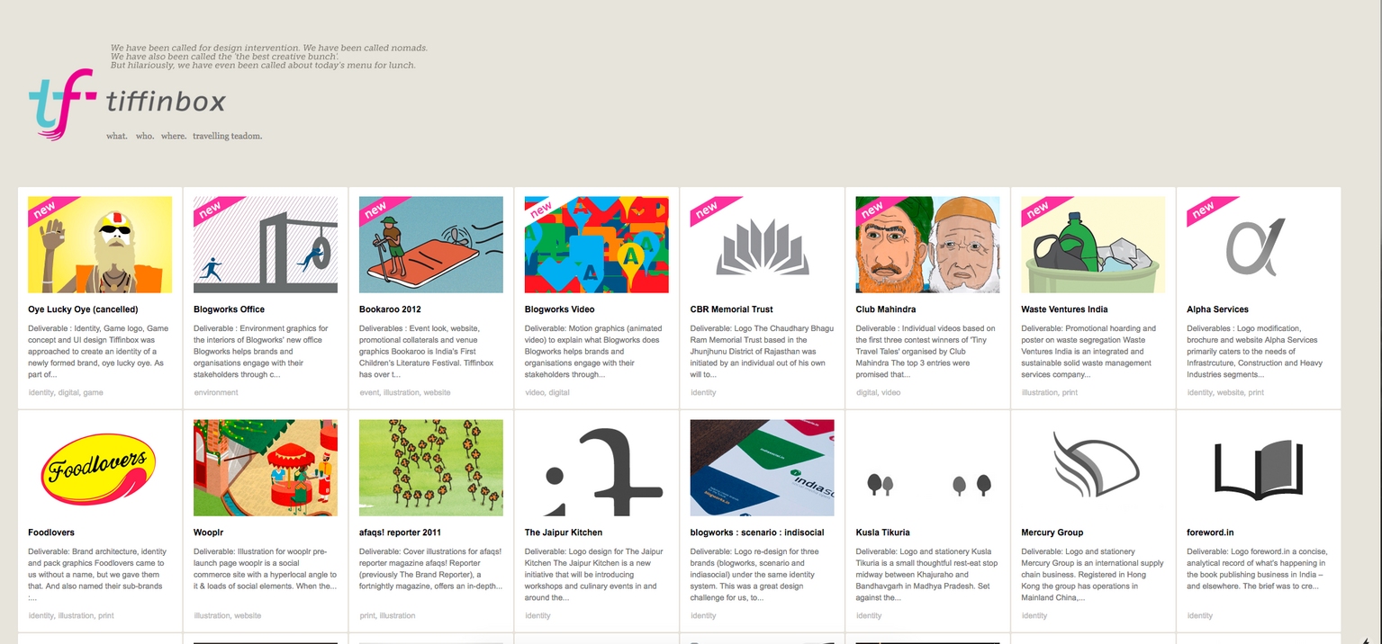
Back in 2009, we published our first portfolio website using a personal publishing platform. The kinds that showcased a very structured grid of thumbnails each representing a project. This was the new norm then and still continues to thrive. People who were tired of Wordpress websites and didn’t have the know-how or resources to go for a custom website found this super easy to understand and operate. As we were just starting out and we didn’t have a budget for a custom website, we couldn’t have been happier. And since this was our first website ever, understandably, we were proud of our growing thumbnails on the home page. But then, after a good few years, we hit the website-happiness plateau.
We reached a stage when one thing or the other would be constantly irking us, and we started spotting more and more issues with the website. All of this was probably driven by a constant change in our aesthetics coupled with online exposure to an ever changing design scene. And eventually we stopped updating our website (though not a conscious decision at that point in time), we lost all the excitement we used to feel about uploading new projects, so December 2012 was the last update.
2013: Trial 1. Almost a replica of our first website.
In January 2013, we decided to go for a re-design and not just rely on picking a theme from within the publishing platform. The problem with themes is there’s no perfect theme that would tick all the boxes for you, and unless you are willing to compromise there’s no point in wasting time hoping one day you’d get what you have been looking for. If it’s in your head you might as well make it happen. We were designers, after all, we should be designing our own website!
And so we began, happily. We were so kicked, that in fact, we switched our payment mode (on the publishing platform) from yearly to monthly. I would like to take a moment here to appreciate the optimism of our younger selves. We reasoned, that there is no sense in spending money on a year-long plan when we will have a new website in a few months. Inhale. Exhale.
We took a good year to realise we were failing and the process of reaching a beautiful shiny new website wasn’t going anywhere. At least not in the time frame we had expected.
Our first mistake, we were working on it like it was some side project for us, so our investment into the design was on and off. And we were working with a freelance developer who had many other side-projects that kept him more interested, so the tiffinbox project was on and off for him as well. Which turned out to mean that our on and offs hardly matched to make any meaningful progress. By the time we would add a new page/component/element to the website we would start disliking what we had done months ago.
Second, we wanted to make it fancy looking. So we designed ‘small’ pixel perfect icons to go with our services, we used ‘small’ (almost miniature) type to achieve what exactly we can’t be sure of now, and we used ‘small’ thumbnail-sized images to basically (and unconsciously) replicate what we already had in the then live website. It was like we were trying to re-design the same theme we were using then. There was no fresh approach to this. Oh wait! There was. We used a ton of cheap and artificial looking gradients*. It was all just a recipe for disaster. And by the end of 2013, we put an end to this particular attempt.
* truth be told, we are feeling a lot of satisfaction trashing our old work.
Limbo 1
Early 2014 to Mid 2014
Our website went on a back burner. Client projects got us busy. I am not sure what irked us more: the then live website or the 2013 botched attempt at redesign, so we blocked them both from our minds.
Trial 2
2014-15: Trial 2. Bigger, bolder and still not beautiful.
Mid 2014 - Mid 2015
Fed up and disgusted at not having updated our website in a long while we decided to open this chapter yet again. But before that, we momentarily logged in to the website back-end to disable some projects that were no longer appreciated by us for their design quality.
This time we were going to look at things from a fresh perspective. Big and bold, full-width images, only one project on the screen at a time, fewer words and more visuals. We did that but this too tanked. What happened? Got bored of it I guess, yet again. It lacked that timeless feel which made it die an early death. Also, nobody here was exceptionally excited with the new designs to begin with. They were just different, not wow.
We feel a direction was lacking both these times. We weren’t sure what we wanted to achieve and how we wanted to achieve it. A small incident further reflects how it was turning out impossible to carry on. There was a small bar of 5 pixels height. There was no consensus on this. Should it be a couple of pixels thicker or thinner? Or should it 5px. The three of us never agreed on the others’ versions. That is when we realised we weren’t designing for a collective rather for three individual designers with a strong sense of preferences.
With this attempt we didn’t even bother with a programmer and shelved the design before anyone else could see it.
Limbo 2
By now, we had gotten quite used to telling new clients that our website hasn’t been updated in a while.
Mid 2015 to end 2015
By now, we had gotten quite used to telling new clients that our website hasn’t been updated in a while. But evidently, we had to share new work because we were increasingly starting to disassociate ourselves with designs showcased on the then website, and we didn’t want those aesthetics to define us. Hence, we prepared a profile document which carried important details about the studio in addition to some of our latest works.
Yes, a pdf profile. Just the way we had started off, just what had seemed limiting and unprofessional. We had circled back to square one.
Trial 3
Early 2016 - End 2016
At the start of last year, we decided, to hell with the ‘bars’, to hell with the ‘circles’ and to hell with anything that is ‘created’ as part of design. We decided to not have a single element other than the photos and text. There won’t be any accessory. We decided to make it minimal to the extent that there is more white-space than not. We decided to arrange type in such a way so as to automatically suggest blocks of distinct information and establish hierarchy. So we did that. And the result was curiously opposite of the earlier processes. We did not instantly fall for it and there were lingering doubts (“where’s the ‘border’ around the images?”). But slowly we got addicted. So we kept pushing, we kept refining; we got hooked.
And to be absolutely sure we had a website this time around we approached our friends at Miranj and asked them to develope the website for us. Having worked with them on a client project before we knew how they worked. They are methodical, use effective tools and ask intelligent questions; things that we surely needed to see this to a conclusion. This blog, funnily exists because of their processes. They needed pages with real content. So we created one :)
We did it! We rebooted on the 1st of May 2017.
Beginning 2017
Yes, we have procrastinated a fair bit even once the new website was developed and uploaded for testing. If one of us was able to find time to upload a few projects, the other was busy. If the other got time, another couldn’t. Everyone was trying, but it seemed like a very inefficient relay. Then finally one day towards the end of March, we got that push we needed. Miranj informed us of the May1Reboot, which is “a simple idea of collectively relaunching their websites at the same time — and in doing so — rallying each other and sticking to that one deadline.” We finally had a date.
In the beginning of 2013 when we shifted from yearly to a monthly payment plan, we didn’t expect this. We continued to shell out $9 per month for 48 months instead of $66 per year for 4 years.