A Well-read Tablet: Branding Kitablet
Parag (an initiative of Tata Trusts) came to us with a need for a face to a clever name. A ‘kitab’ and a tablet, Kitablet is India’s first e-library app for children’s books. This app, a teller of stories, needed a dynamic and fun-filled logo to speak to children between ages 6 and 12.
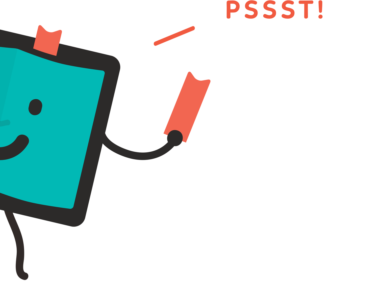
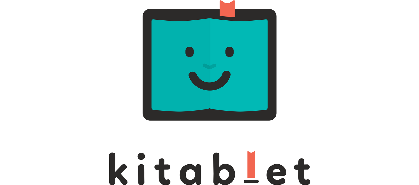
We devised a character with the body of a tablet and the face of a book (also known as kitab in Hindi). The story about him goes such: there once was a tablet that loved stories and so he read all the time. Wherever he went and in whatever he read, he left a red bookmark. He read so much that he became one with books, joy spread across his face. And he came to be known as Kitablet.
Since then, Kitablet, with an insane collection of books inside him has been meeting kids and telling them stories. Such a simple, sweet life makes him happy, so he is always smiling. Unless there is that rare occurrence when he can’t find a book.
The red (or ‘read’) bookmark is used a unique identifier that overtime we would hope becomes memorable and synonymous with the place for Indian children’s’ literature.
We are proud to be associated with the great work Parag is doing in the children’s literature space. Since 2013, we have been working with Parag on projects of varying sizes and scope. The ones featured on this website are – rebrand of Parag, an award that honours excellence in children’s literature in India, Kitablet app design, three Parag events, and a diary.
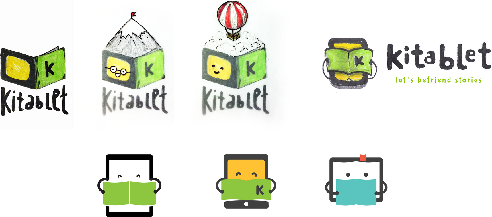
The static logo, the ‘talking’ logo and how we got there
The logo employs simple shapes while at the same time retains a boldness which works well for the target group. The simple geometry also helps make the logo very scalable as it also needs to double up as an app icon.
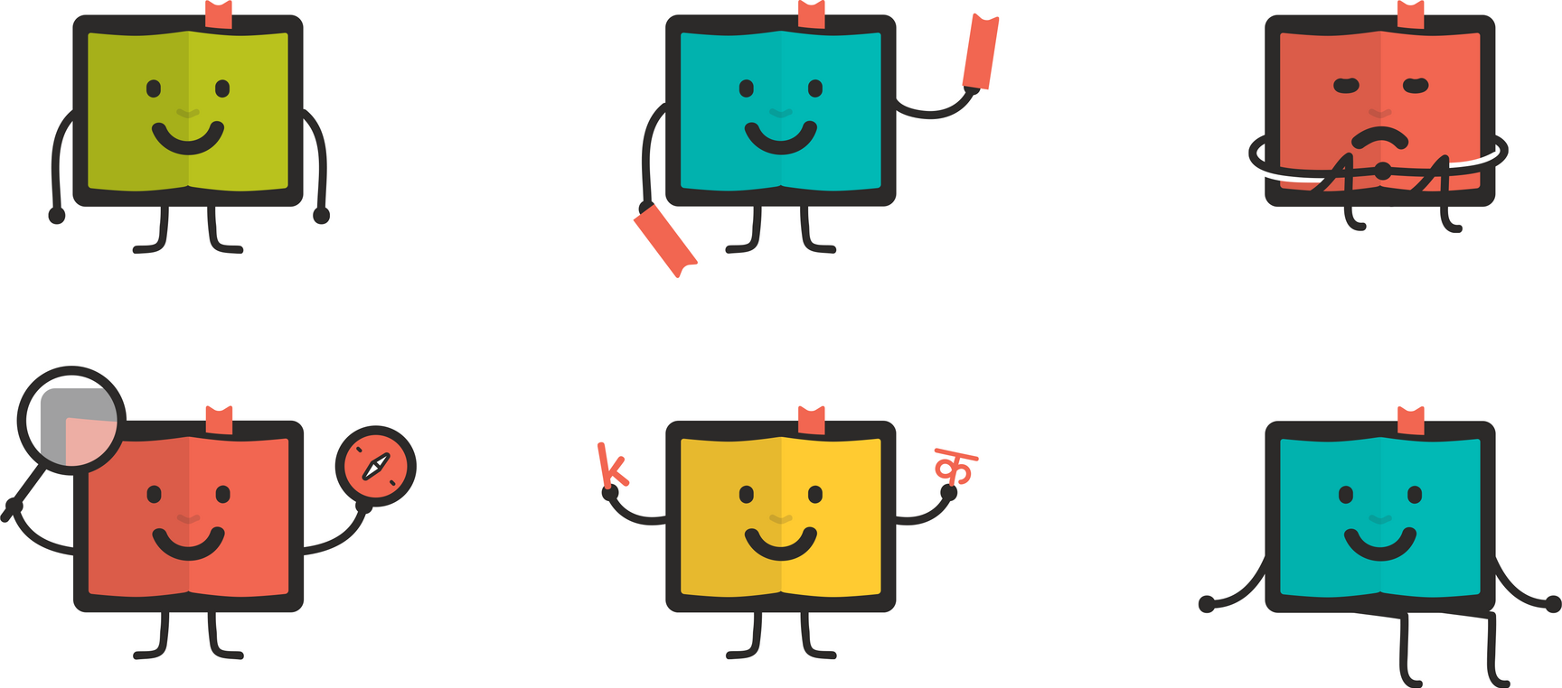
To make the logo dynamic and ever-evolving we created a set of moods, activities and situations around the logo. As part of the initial launch of the brand we created a basic set of joyful talking logos that were doing everything between holding up a stack of books to searching or explaining what he does.
“Your work has brought good cheer to my start of the day :)”
“It makes me curious about this well-read character. And I feel like making him a friend.”
“I feel it is simple, neat and yet a logo that has a lot of scope for dynamism and emotiveness, which is its strength as it lends itself to be converted to a character who interacts with children on behalf of the product.”
Various members of the Kitablet team chip in with their thoughts.
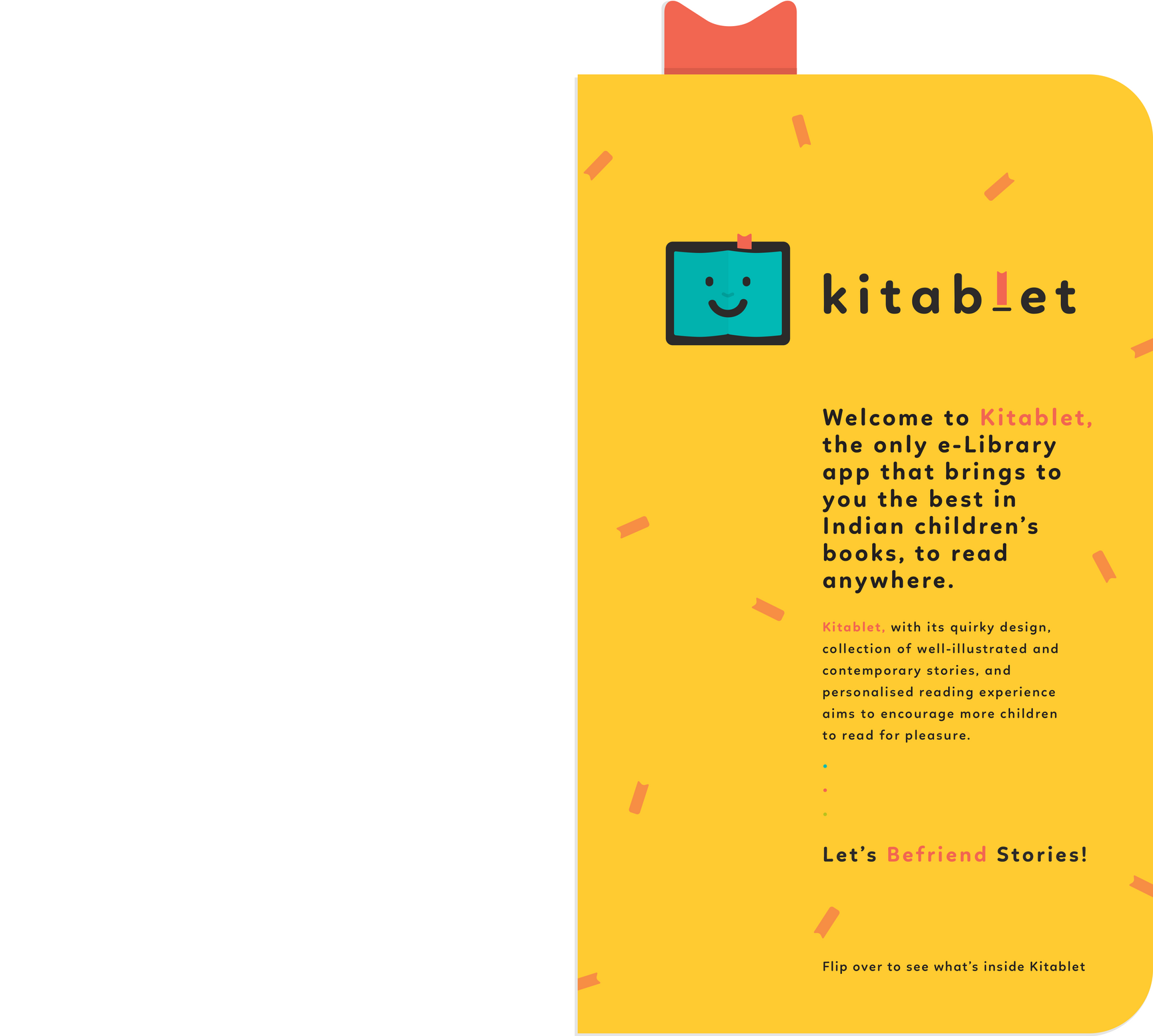
The Kitablet flyer
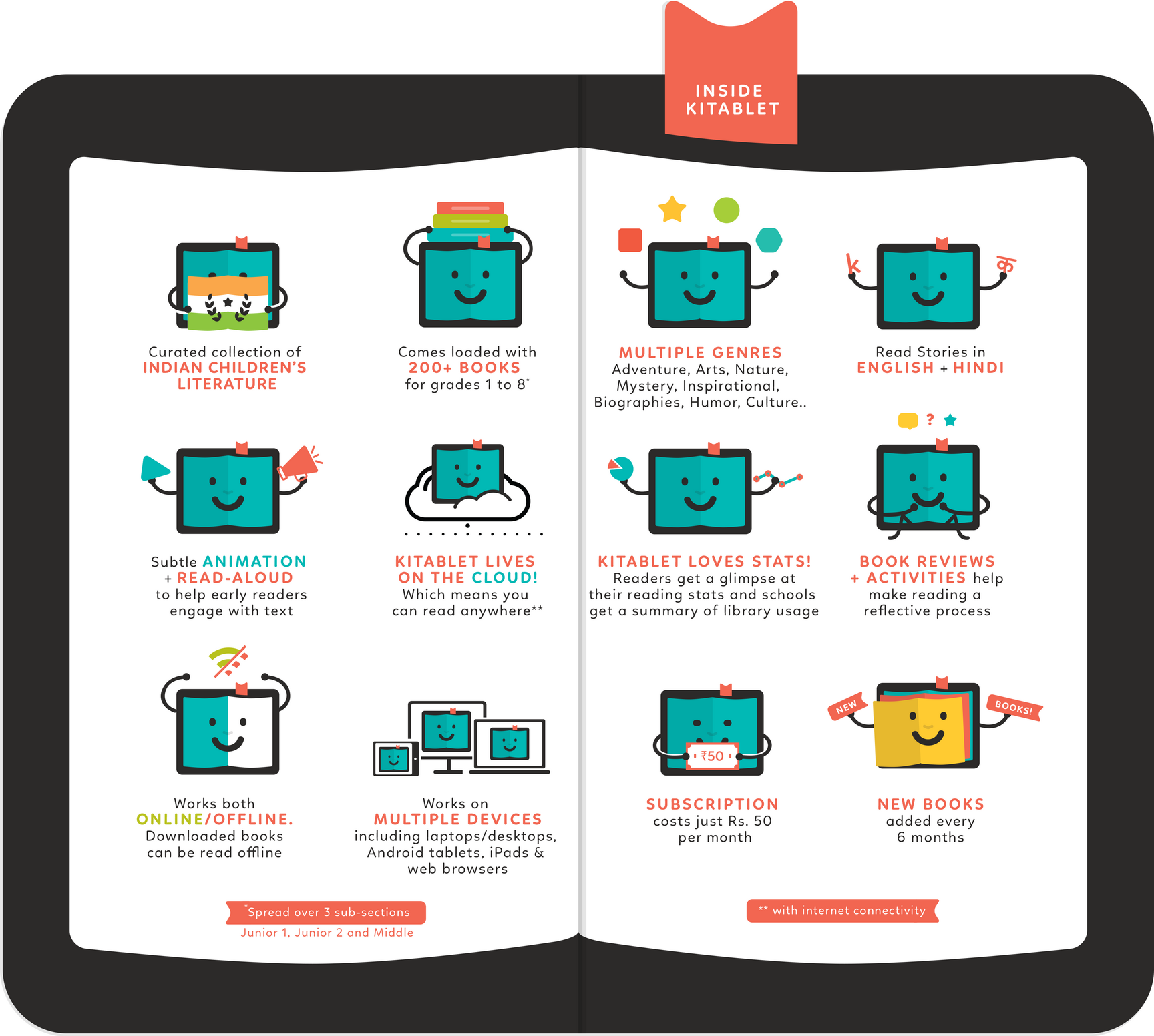
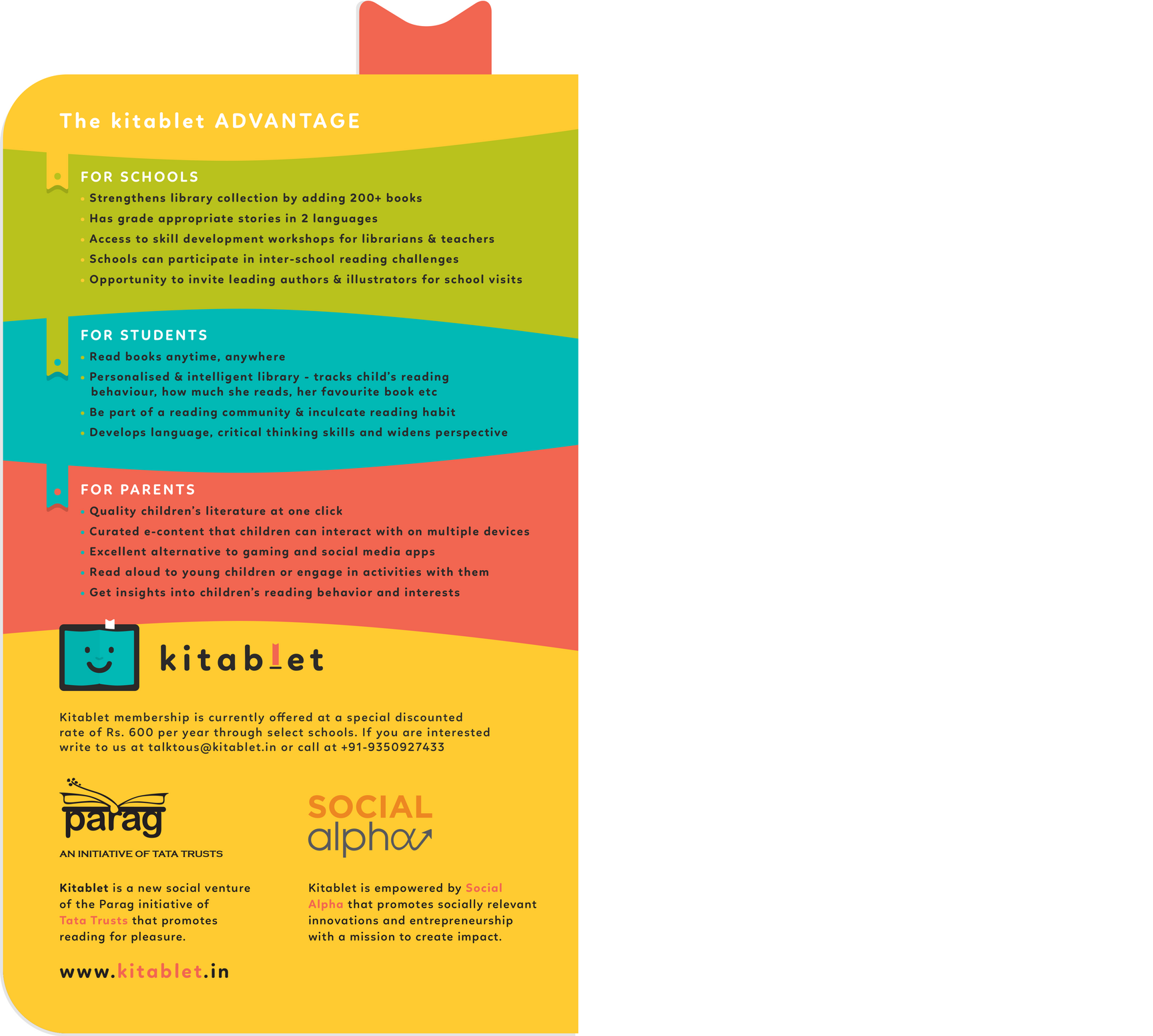
We designed a simple and to-the-point informational flyer that mimics the Kitablet logo. Once open, the spread takes on the characteristics of the logo shape and small red bookmark. What’s cute is this red bookmark works even while the flyer is closed, it peeks from the top as a reminder of the information inside. The talking logo takes on 12 avatars and talks about its many features and benefits.
Kitablet website
Under the first phase of its marketing campaign, the app needed a quick online presence to reach out to schools for memberships. We put together a simple website, that echoed the design sensibilities of it’s logo and app design, on the web development platform - Wix.
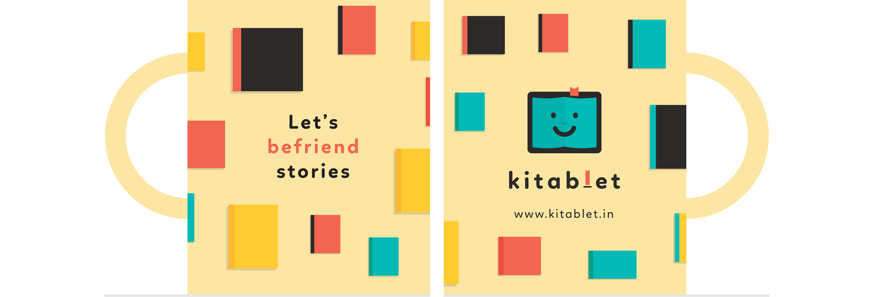
A Mug
that was developed as a giveaway to schools.