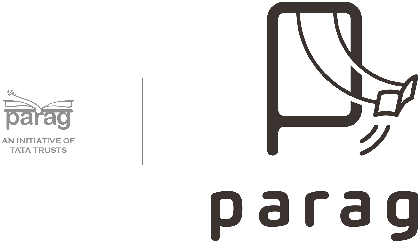
Swinging on Stories: Rebranding Parag
Our association with Parag started in 2013 when we were commissioned to design a new year diary that championed children’s literature in regional languages. Over the years, with a steady increase in Parag’s portfolio of work and related design requirements, a need was felt in late 2016 to rebrand Parag and bring its visual presence up with the times. A new logo was arrived upon by the end of that year, however, it was over a period of next three years that the identity became more and more self-assured through an increasing number of diverse applications. This is the story of how that came about.
But first, a background into Parag. An initiative of the Tata Trusts, Parag supports the development of and access to good quality storybooks for children in Indian languages. They enable school and community libraries so that children have free access to books, and work with teachers, librarians, and facilitators to develop their capacity to engage with children’s literature. They also nurture the children’s literature sector through awards, professional development courses, and linking stakeholders together.
For the new logo, we wanted to come up with a visual that would instantly bring the two critical aspects – books and children – to everybody’s mind, thereby easily communicating the essence of Parag. Showing books is easy, children not so. So we searched for metaphors that convey ‘childhood’ strongly and came up with a swing.
Every child is always naturally drawn to a swing. It’s an instant reminder of our own childhood and that feeling of being airborne, having fun. Irrespective of age, gender or economic standard, every child would have been on a swing (or fought over it). And just as a swing is a part of every childhood, Parag strives to make reading a happy part of every childhood too.
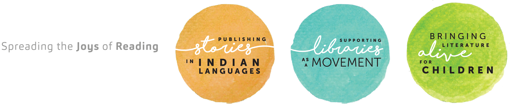
Brand Architecture
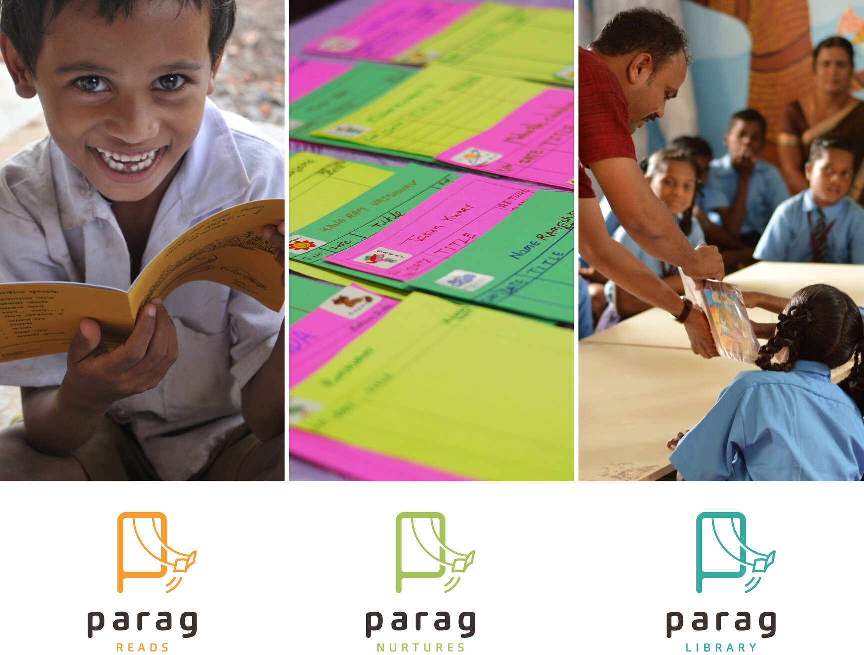
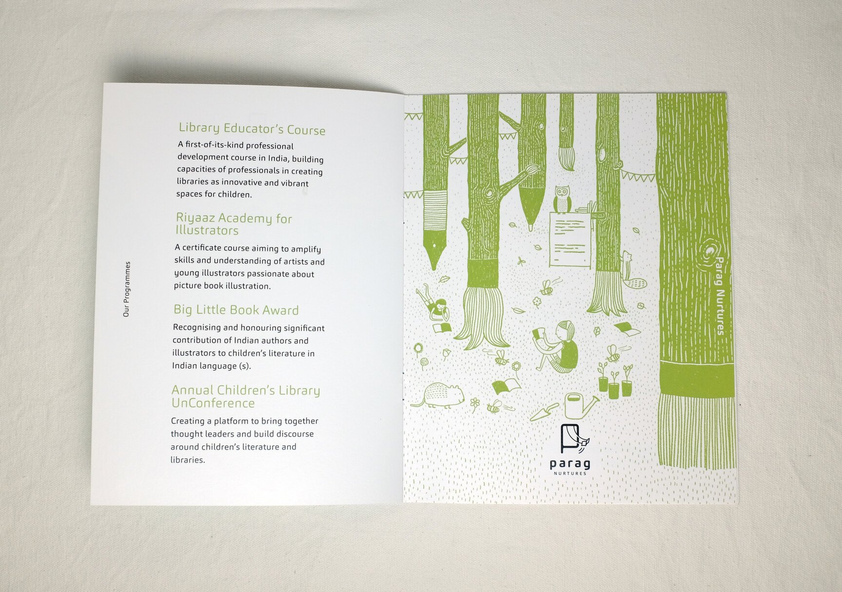
To bring clarity to the story of Parag it was important to clearly differentiate between their three broad areas of focus – support and development of books, capacity building and nurturing of people wanting to associate with children’s literature, and enabling open & vibrant libraries. And so Parag Reads, Parag Nurtures and Parag Library were created.
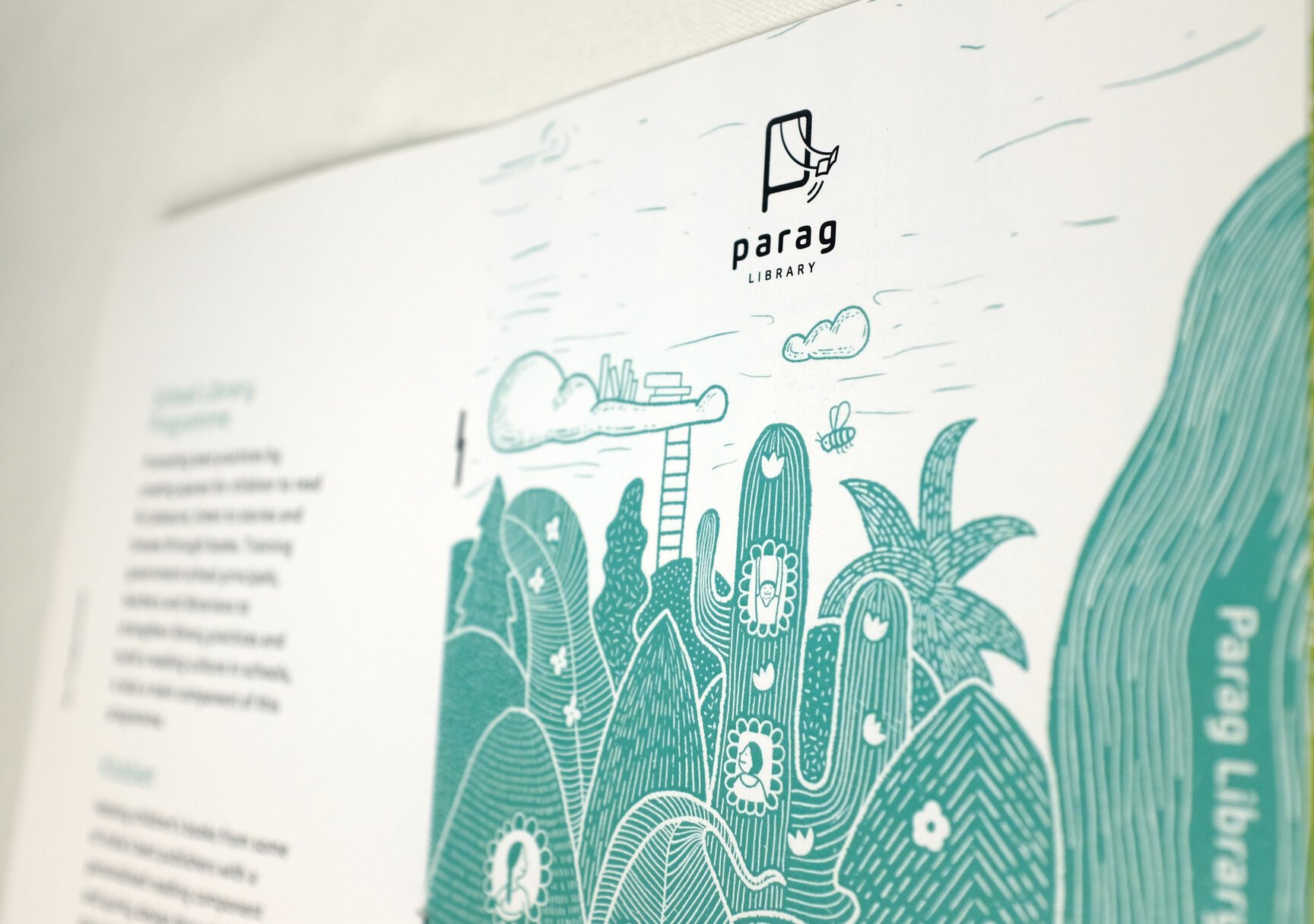
Visualising the three verticals
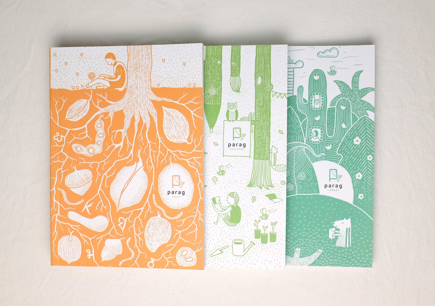
A set of three core illustrations were planned that would each showcase an ecosystem (and by association a brand vertical) and which could eventually be used for various collaterals.
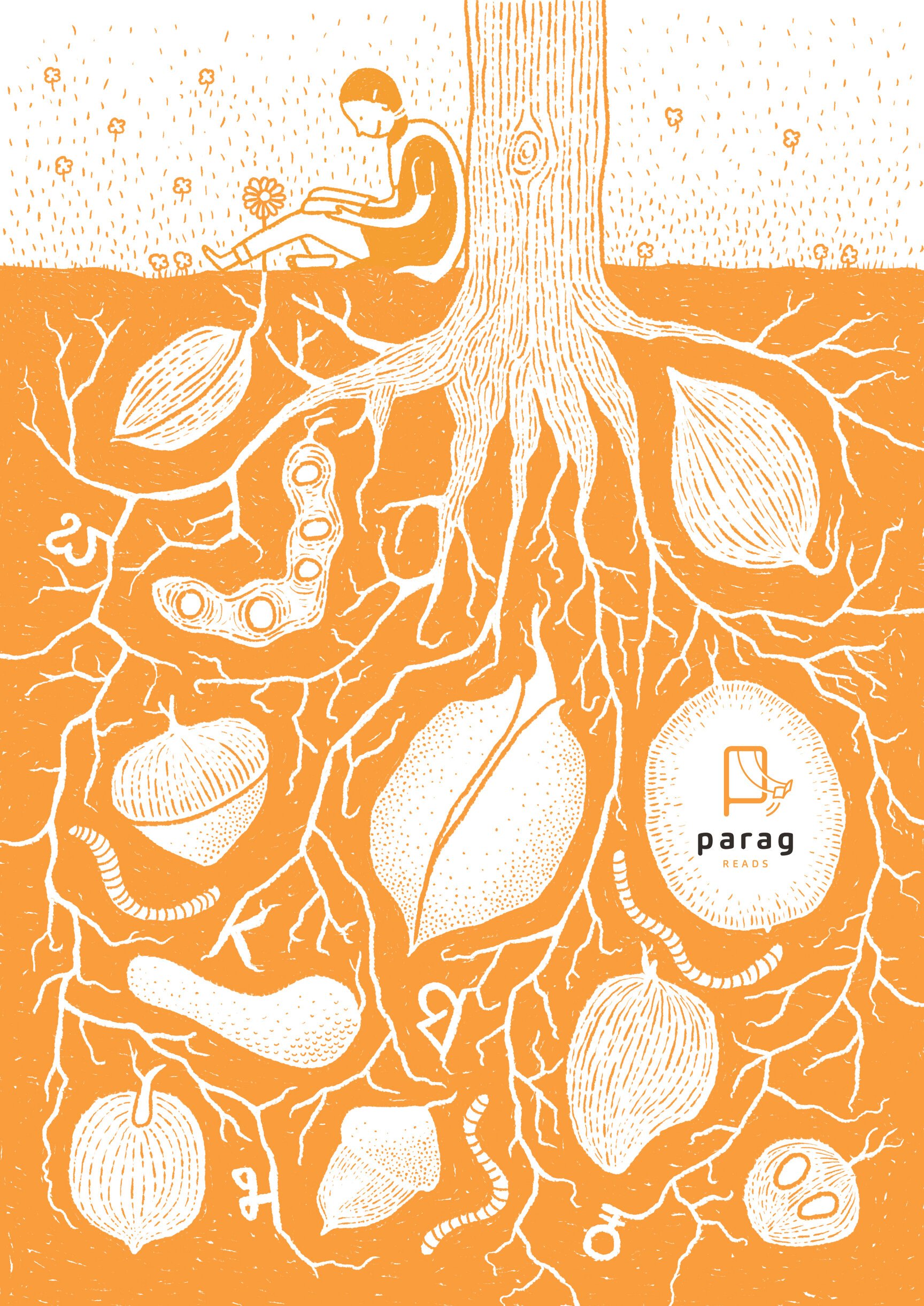
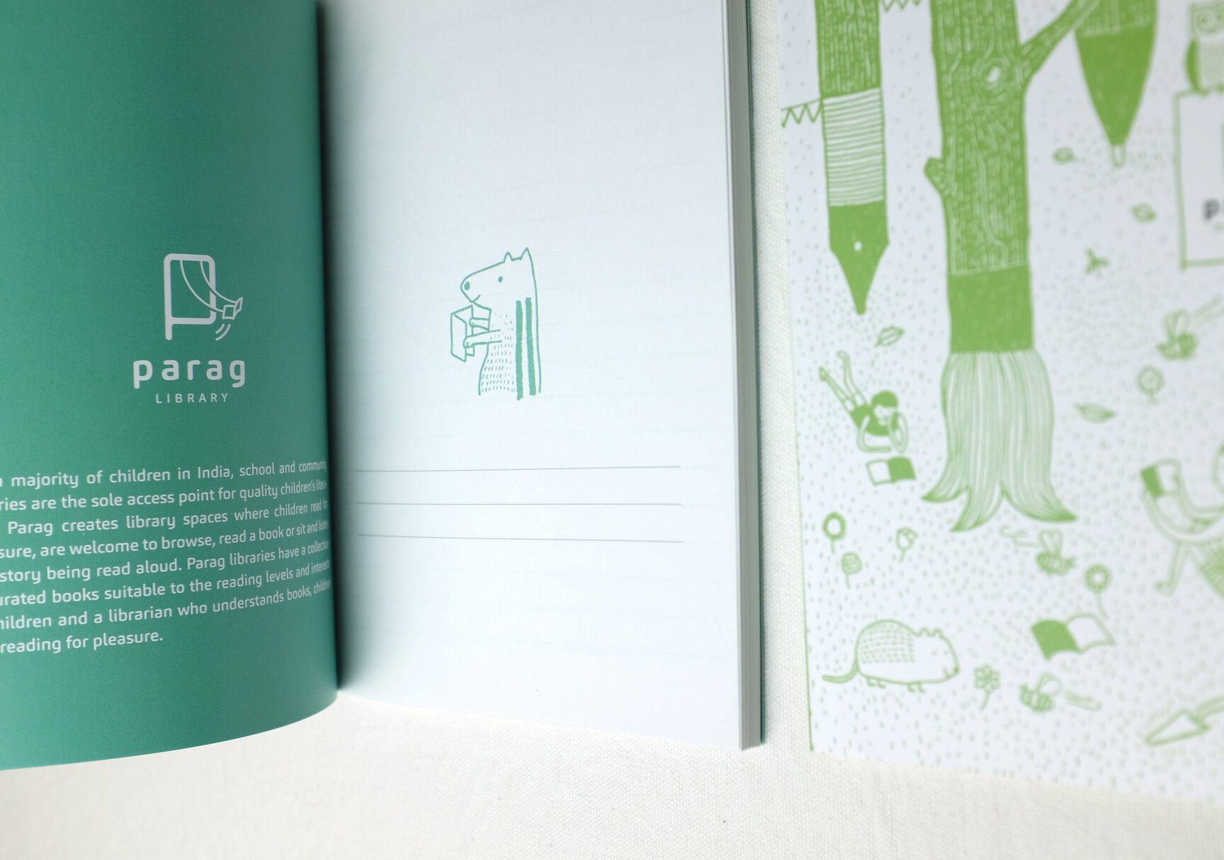
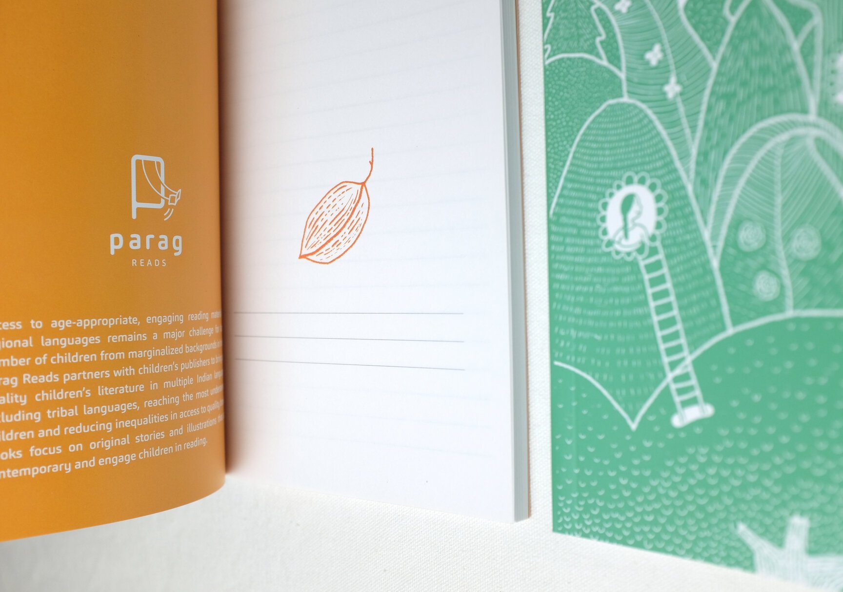
Parag Reads is an underground scene that’s all about the foundation of everything that Parag wishes to achieve, and which can only come about by germination of books in regional languages.
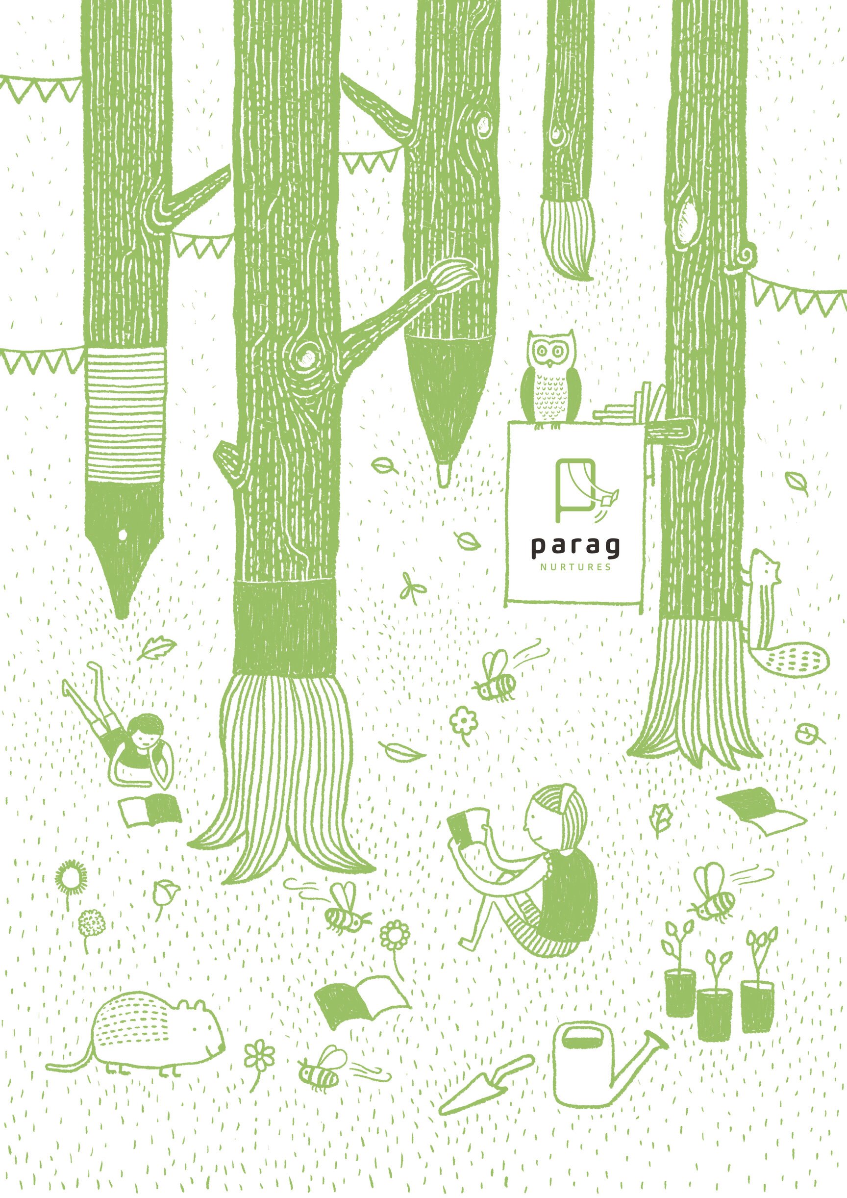
Parag Nurtures is about the ground level – about the trees (stakeholders and professionals that Parag engages with) and about the saplings (new talent and ideas) waiting to be planted. This environment is rich in flora and fauna (read literature) and makes for an inviting atmosphere, buzzing with readers.
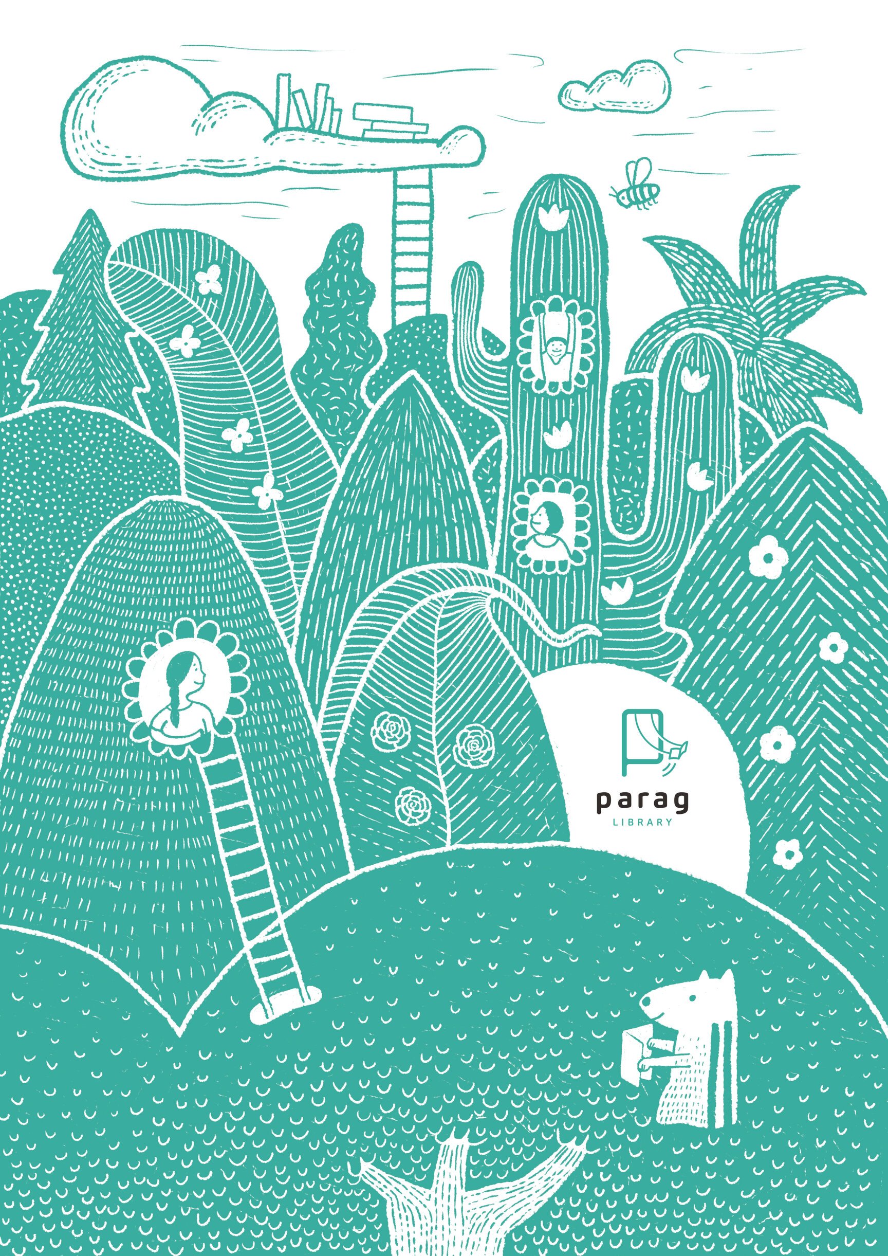
As we keep climbing up, we come to Parag Library which is the canopy that sits at the top of Parag’s world. And the way canopies set the stage for pollination, Parag libraries will be an important source for the spread of literature.
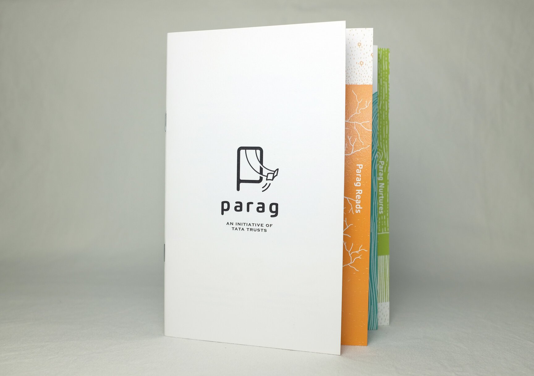
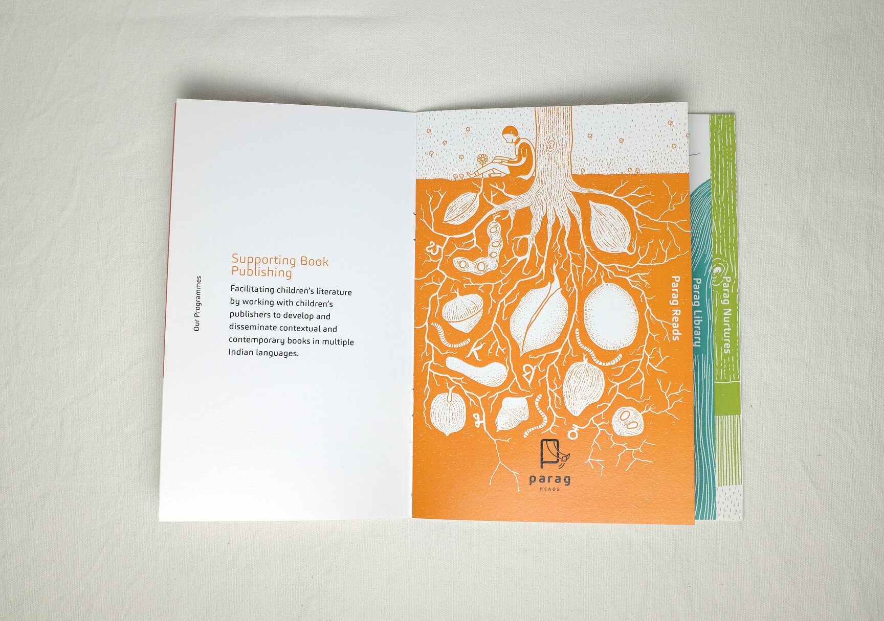
Parag brochure
The above illustrations set the basis for the design of the brand brochure, the structure of which highlighted the tiered setup of the three verticals. The brand look over the years has evolved to a simple, clean and minimal design with a heavy emphasis on illustrations.
New Year giveaway
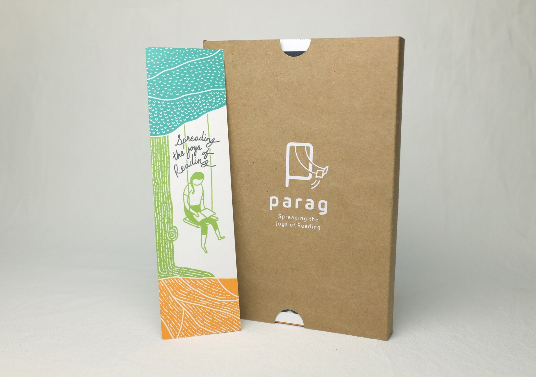
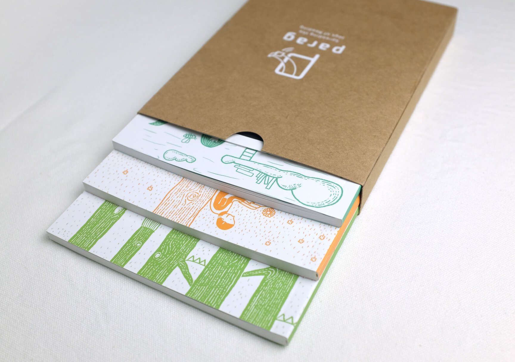
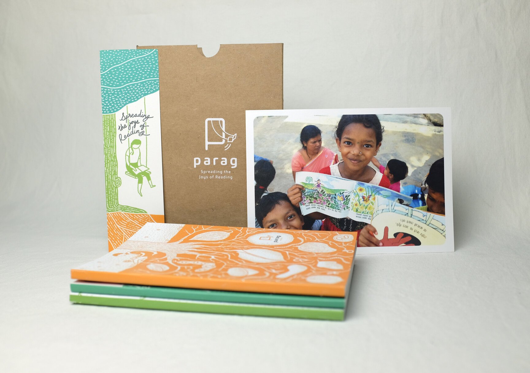
Towards the end of 2018, Parag wanted us to design a diary to gift to its various stakeholders. We proposed a collection of three notebooks, a bookmark and a postcard in a pack of Kraft paper. Each notebook carried an illustration of a Parag vertical with a small note about that vertical on the inside. The bookmark illustrated the brand tagline – spreading the joys of reading – while the postcard carried a photo along with wishes for the new year.
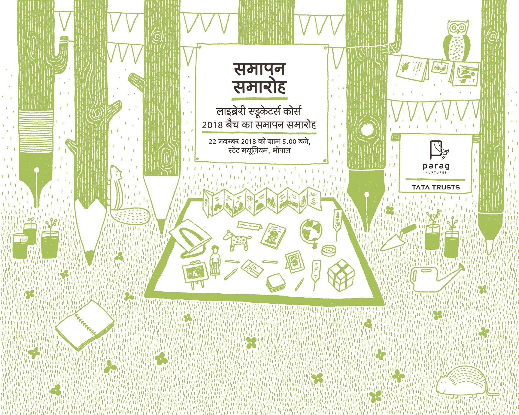
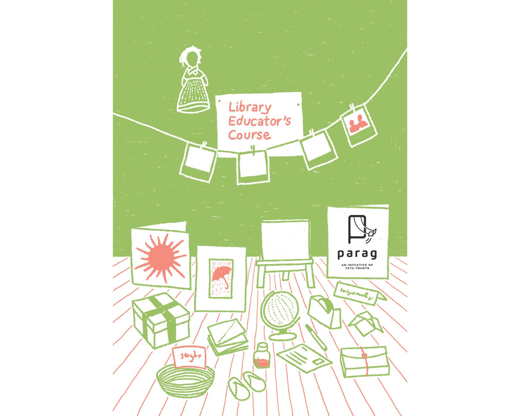
Library Educator’s Course
The illustration tone and style established early on in the new identity’s language was further explored and built upon when it came to designing for a specific programme under the three verticals. Library Educator’s Course (LEC), for instance, used the same setup as that of its parent sub-brand, Parag Nurtures. Shown here are the stage backdrop for the closing ceremony and the cover of a flyer for LEC.
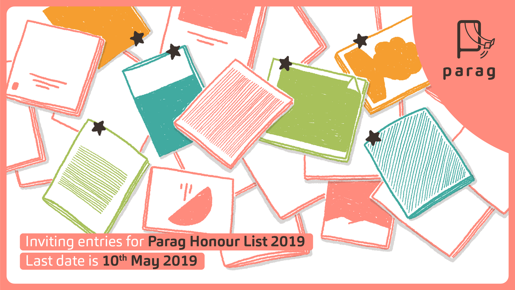
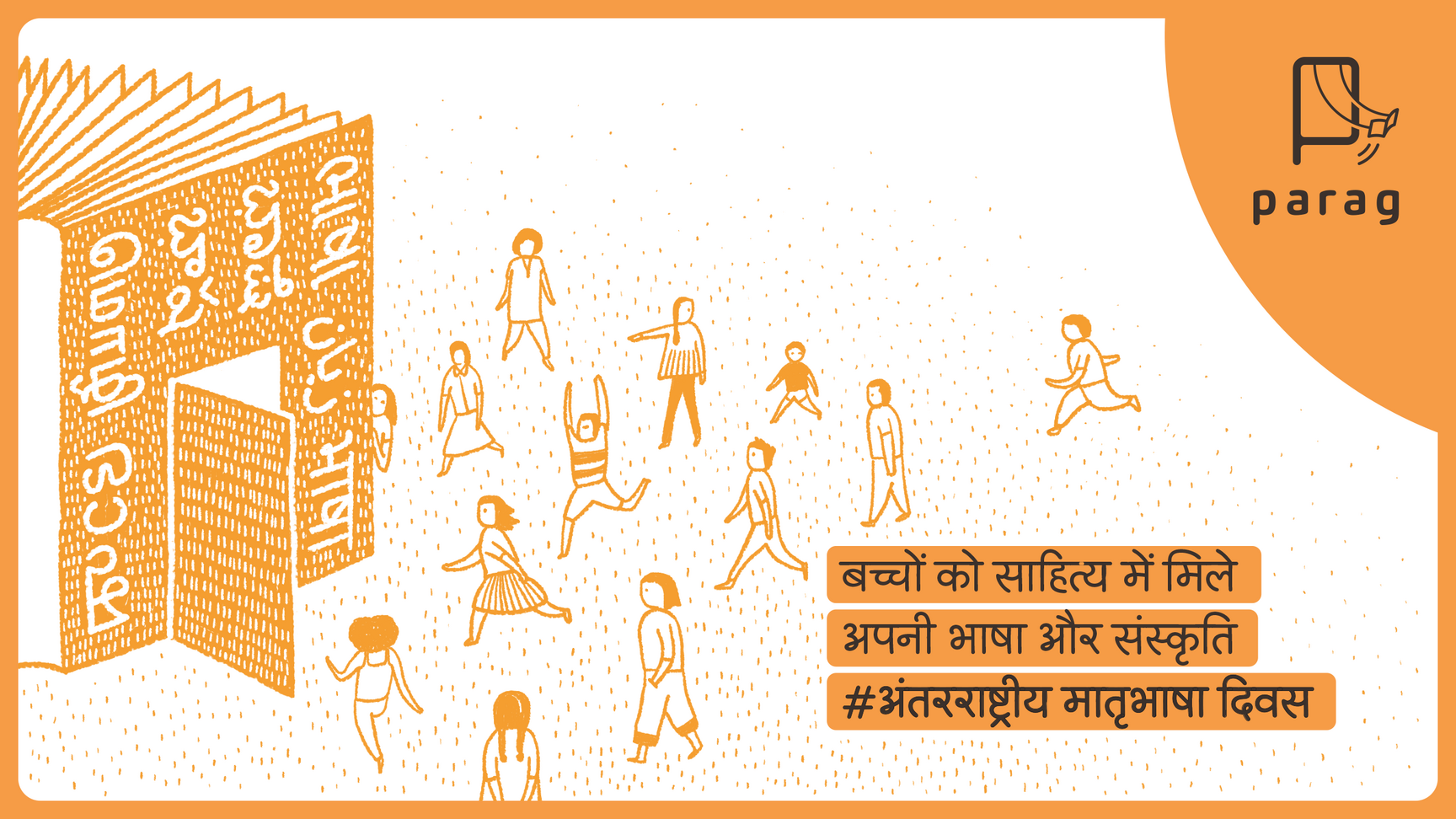
Parag on social media
A template was created for announcements on social media with a continuing reliance on illustrations to keep the brand imagery unique.
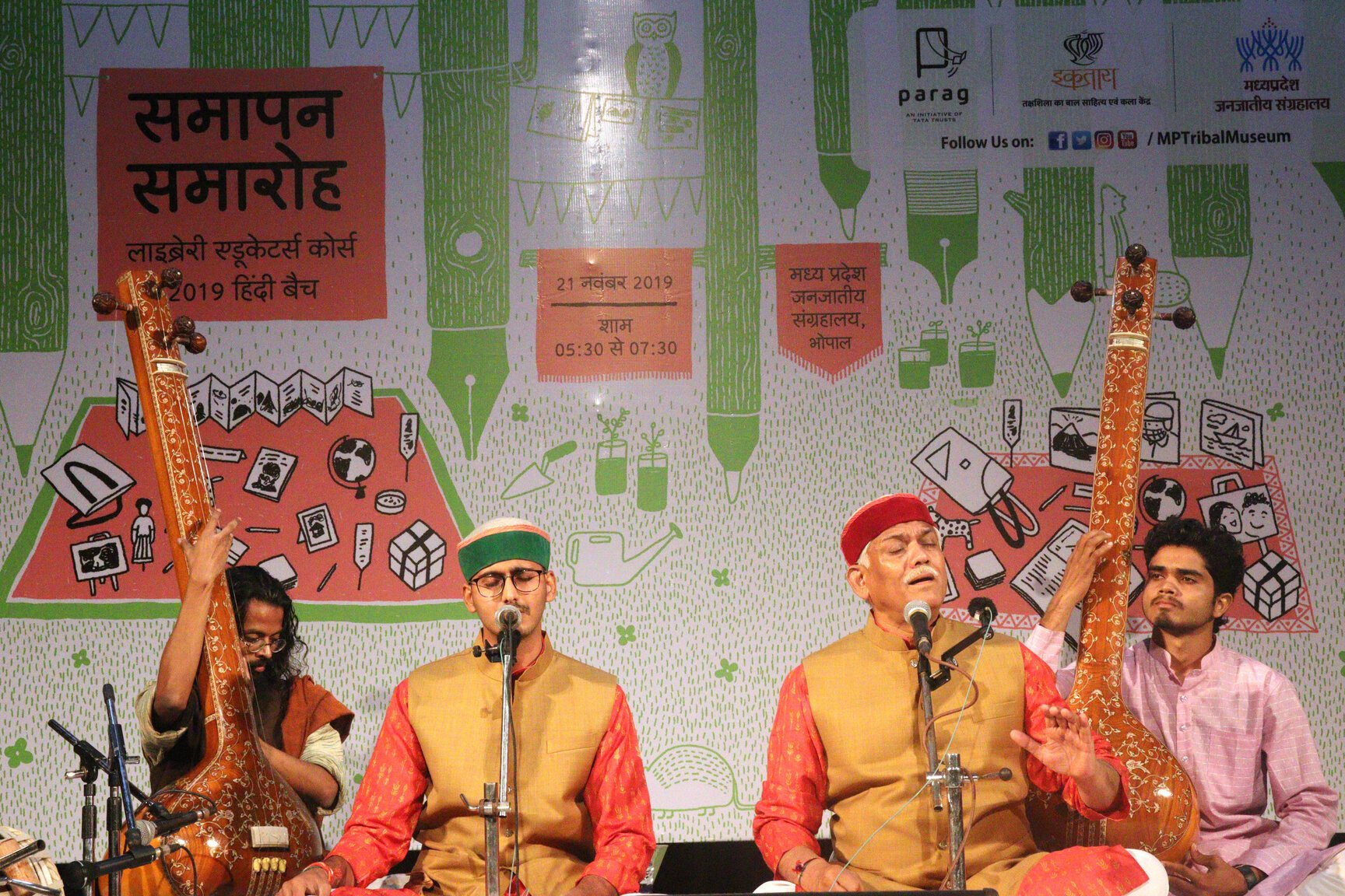
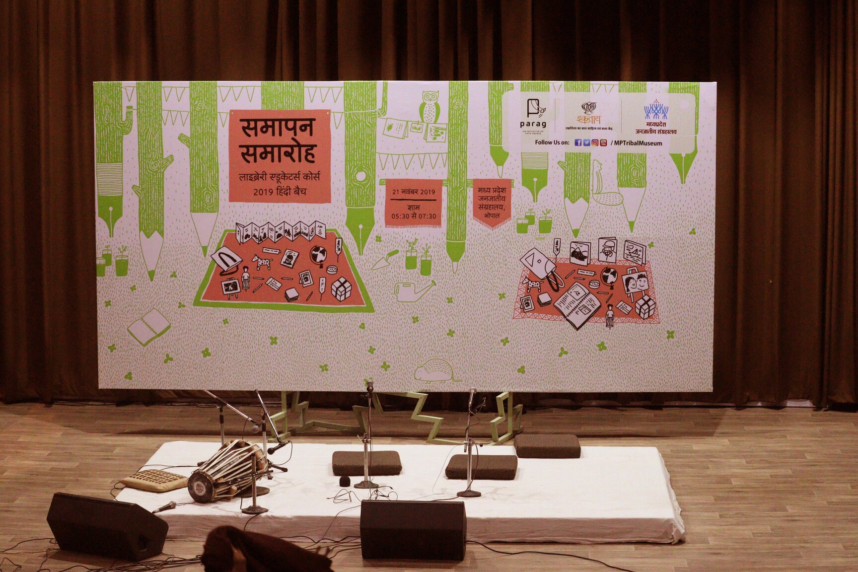
Photos from the LEC closing ceremony in Bhopal (photo courtesy: Parag).
“In the course of designing various elements of and for Parag, we have developed a strong working relationship and a friendship. They visualise with us the long term goals, the brand strategy and different possibilities for Parag. Because the creatives are fresh and out of the box, they leave a lasting impression with those who see them. This partnership has worked because each of us is free to express what we think openly, agree to disagree and take ownership of the final product.”
Swaha Sahoo,
Parag
A New Home for Parag
During the course of rebranding Parag, it was felt that Parag is now ready to have its own website. Ever since Parag began operations in 2005 the only web presence it had was in the form of a mention on the Tata Trusts website. Down the line, this increased to two programme specific websites, one each for ‘Big Little Book Award’ and ‘Library Educator’s Course’. These were meant to address the urgent need of spreading awareness about them. By 2017, it was clear that Parag as a whole would need a single point of access for all its activities and programmes, not just the existing ones but for all the future initiatives as well. The new website went live in the middle of 2018.
Building blocks
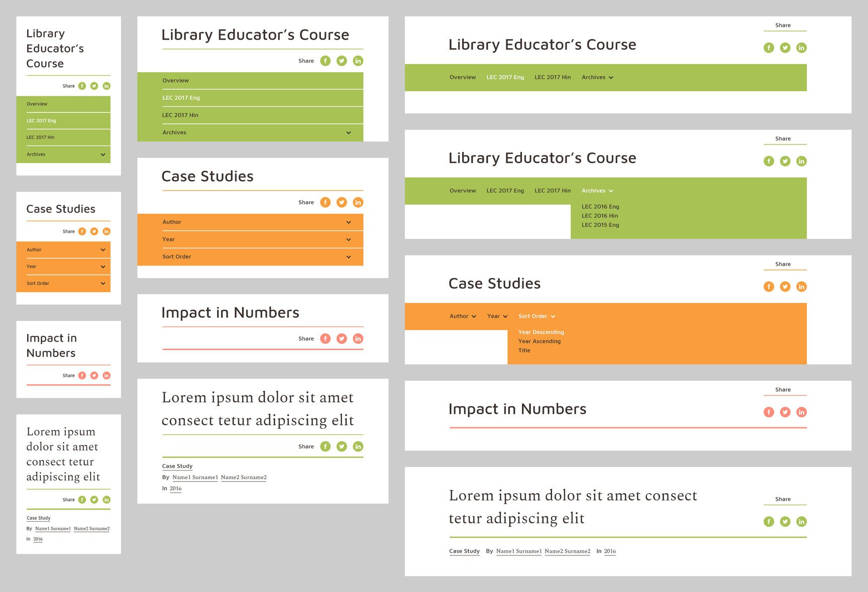
Once the wireframes were in place, unique components were identified (listing, infographics, media, testimonial, and so on) and designed, developed and tested on various resolutions. This modular approach was key to creating new pages on the fly, in future.
As an extension of the branding work we had done for Parag prior to this project, the presence and identity of the three verticals – Reads, Nurtures and Library – was reinforced on the website too. There was a clear demarcation between the three, strengthened by their individual colours. Each vertical housed various programmes under it along with pertinent case studies. So Nurtures is a repository of all courses by Parag, Library showcases various libraries set up by Parag alongside their e-library app, and Reads touches upon their book development work.
The look and feel of the website was in keeping with the brand aesthetic of following a clean and a minimal outlook with a heavy reliance on illustrations unique to the brand. Substantial margins all around added a lot of breathing space in between and around the content, so much so that it irked some people at Parag initially, but have since grown a liking for it :D
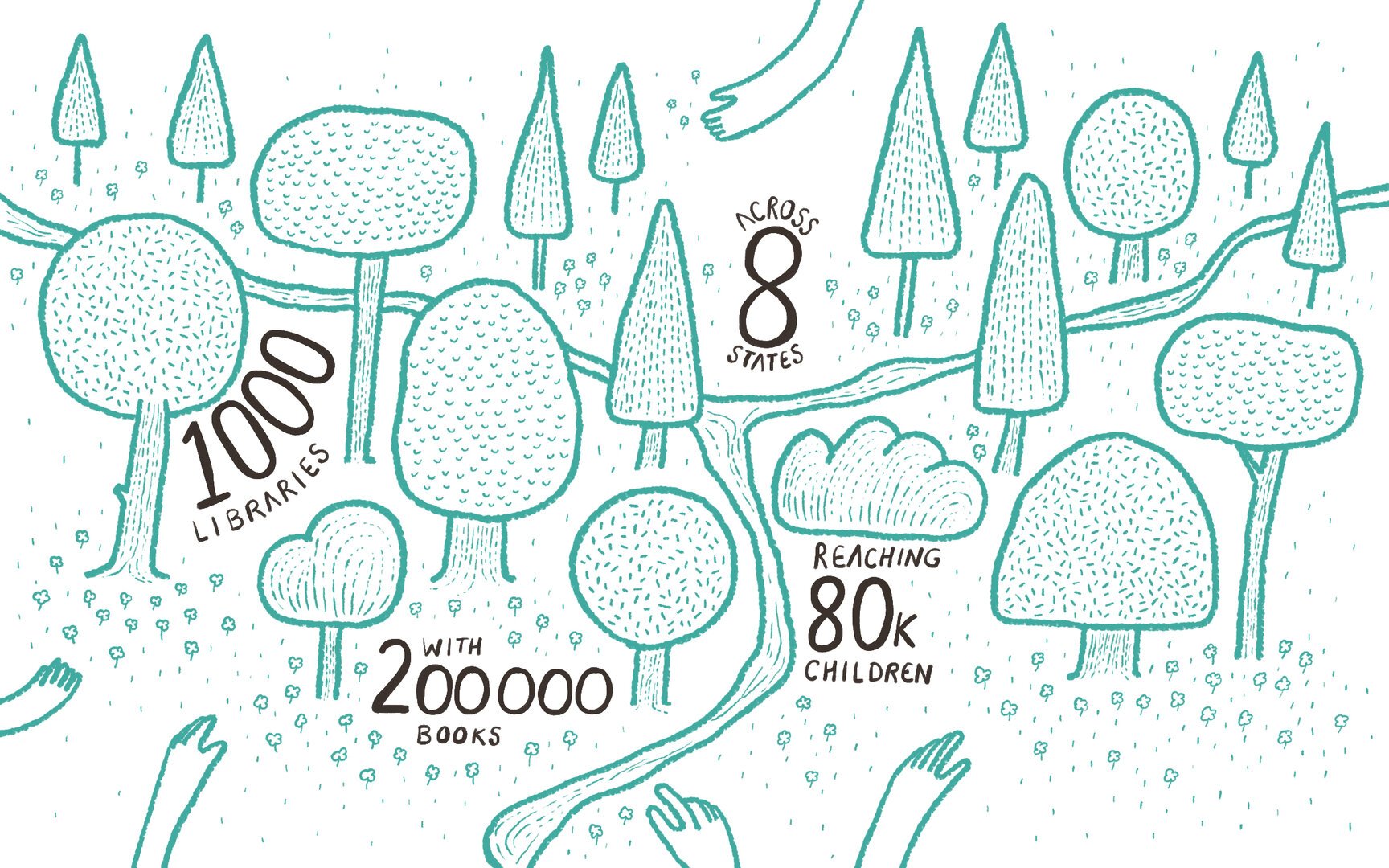
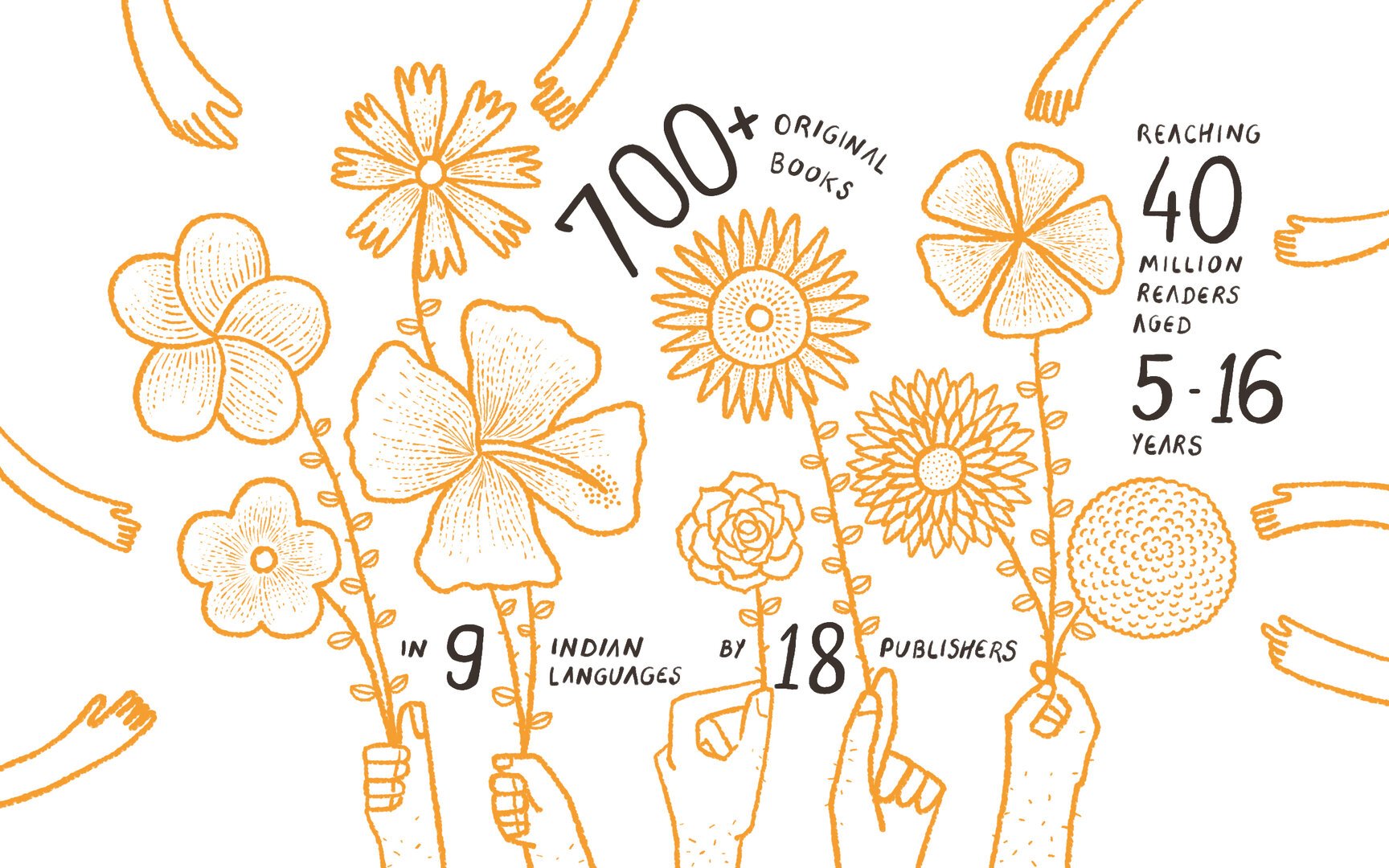
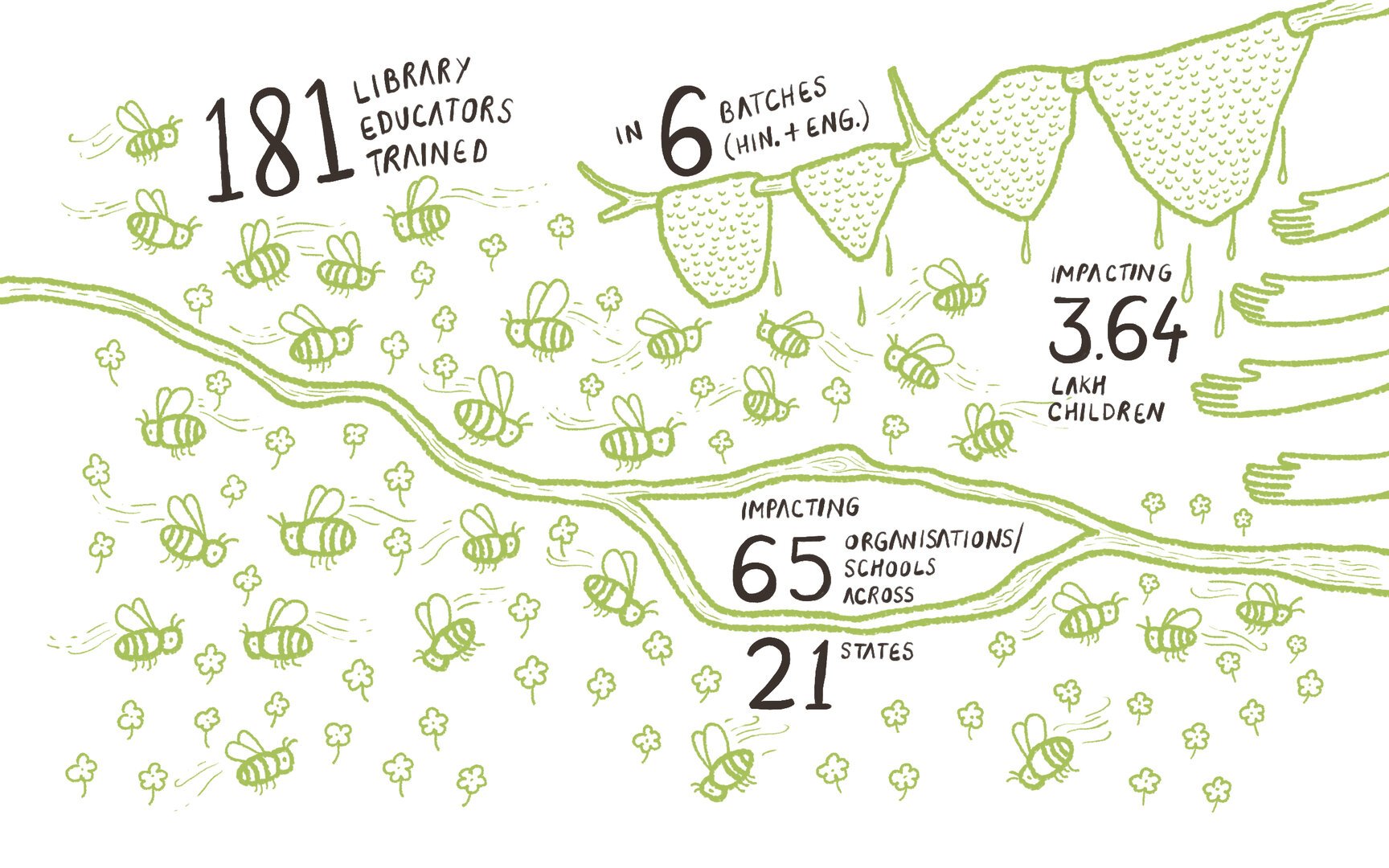
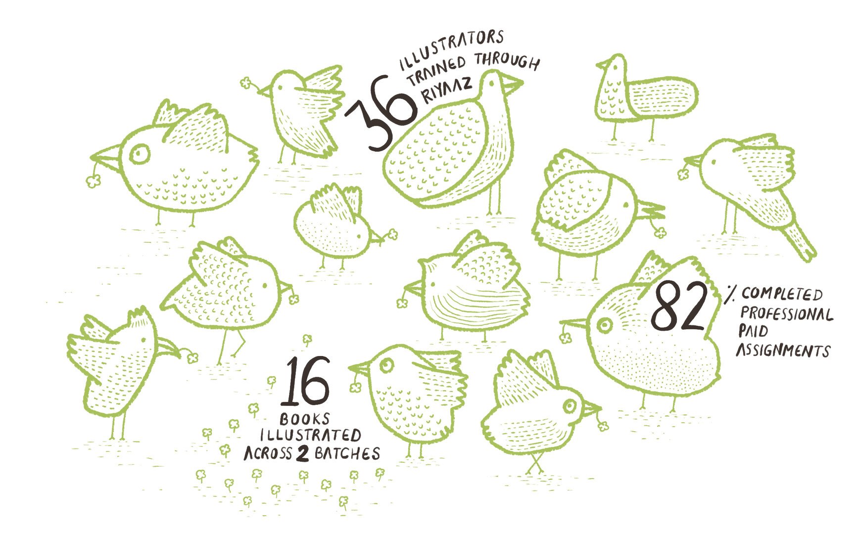
Illustration based infographics for the ‘impact’ section of the website that highlight the impact and reach of Parag’s various initiatives.
We are proud to be associated with the great work Parag is doing in the children’s literature space. Since 2013, we have been working with Parag on projects of varying sizes and scope. The ones featured on this website are – an award that honours excellence in children’s literature in India, an app for children’s books, three Parag events, and a diary.