Visualising Kitablet: An E-library App for Children
Parag (an initiative of Tata Trusts) as part of its mandate to promote children’s literature in Indian languages started work on building a digital library called Kitablet. This e-library app, India’s first for children’s books, will be initially available to students of grades 1 to 8 through schools on a subscription basis and will feature books from some of India’s best publishers.
Tiffinbox was approached with the task to design the app’s UX and UI. The challenge was to keep the design fairly simple (yet not boring) so as not to intimidate its young users with its seemingly complex and rich offerings, such as the convenience of accessing the library from one’s home in addition to the ability to continue reading at school, three types of unique ways to enjoy and interact with the books: read-aloud, animation and activities, three libraries to browse (on the basis of students’ grades: Junior 1, Junior 2 and Middle) and the possibility to access a browser based version of the app to generate user reports (a feature primarily targeted at parents hoping to find out more about their child’s reading habits and pattern).
While learnings from a pilot of a basic e-reader app (of which Tiffinbox was a part too) set the foundation for the development of Kitablet, sessions on requirement analysis effectively rounded up the visual and technical expectations of the product. And some of those key aspects of the product have been highlighted below from a design perspective.
We are proud to be associated with the great work Parag is doing in the children’s literature space. Since 2013, we have been working with Parag on projects of varying sizes and scope. The ones featured on this website are – rebrand of Parag, an award that honours excellence in children’s literature in India, Kitablet’s branding, three Parag events, and a diary.
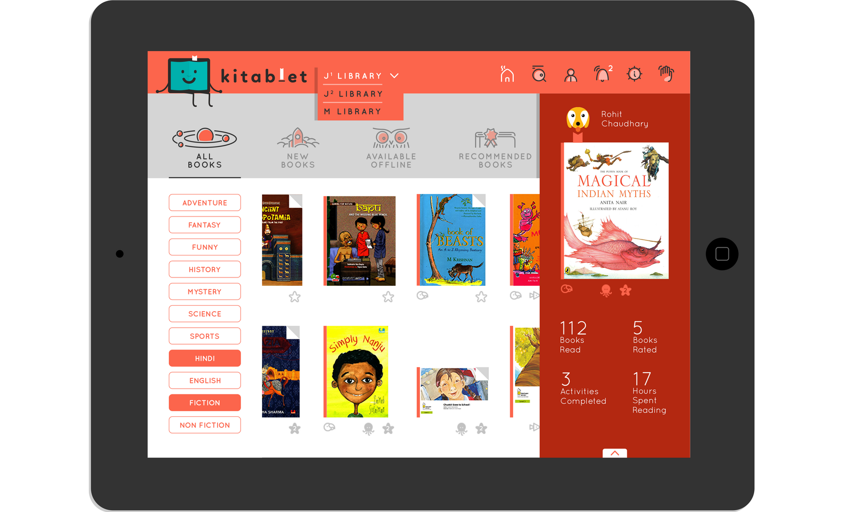
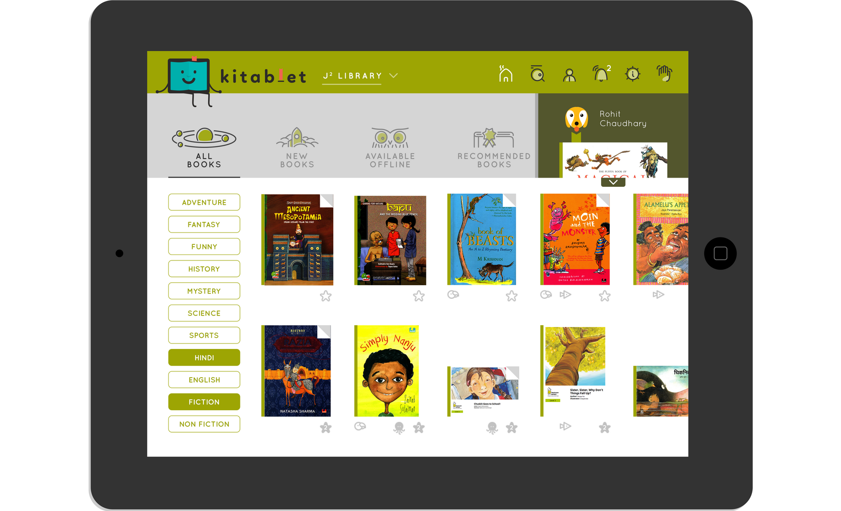
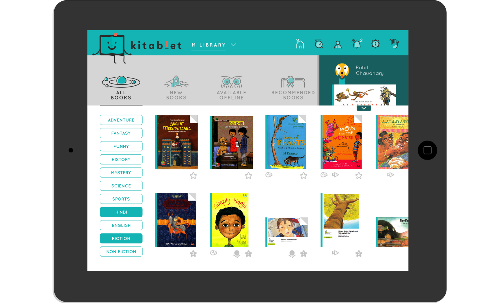
Homepage and the three libraries
The Home page is where all the stories are. Part of the top navigation are wormholes linked to search, profile, announcements and settings. There is also that necessary but evil ‘goodbye’ button. All the books available in Kitablet are featured in a horizontally navigable zone separated by a set of imaginative secondary navigation icons (we will come to that later, we love it so much that we gave it its own section). On the home page these buttons essentially help the reader filter through the available books. Home also features a collapsable dashboard for quick access to the book currently being read along with a listing of reading-related stats.
Kitablet consists of three libraries segregated on the basis of grades. Termed as Junior 1, Junior 2 and Middle, these libraries have distinct colour palettes to differentiate them from each other and to bring a sense of newness when students progress to a grade of the higher library. And though a student who logs in is shown his/her pertinent library, he/she has the option to browse and read books from the other two libraries as well.
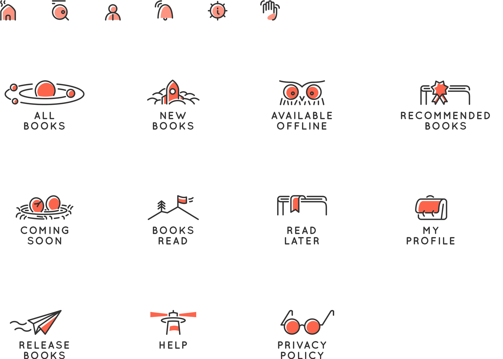
The icon family
Each page of the app features a secondary navigation which further segregates the content. For instance, the solar system is where all the stories are, a rocket is for newly launched books and an egg just about to hatch denote books coming soon!
The icons using symbolism make associations with related concepts to add a layer of storytelling to the design.
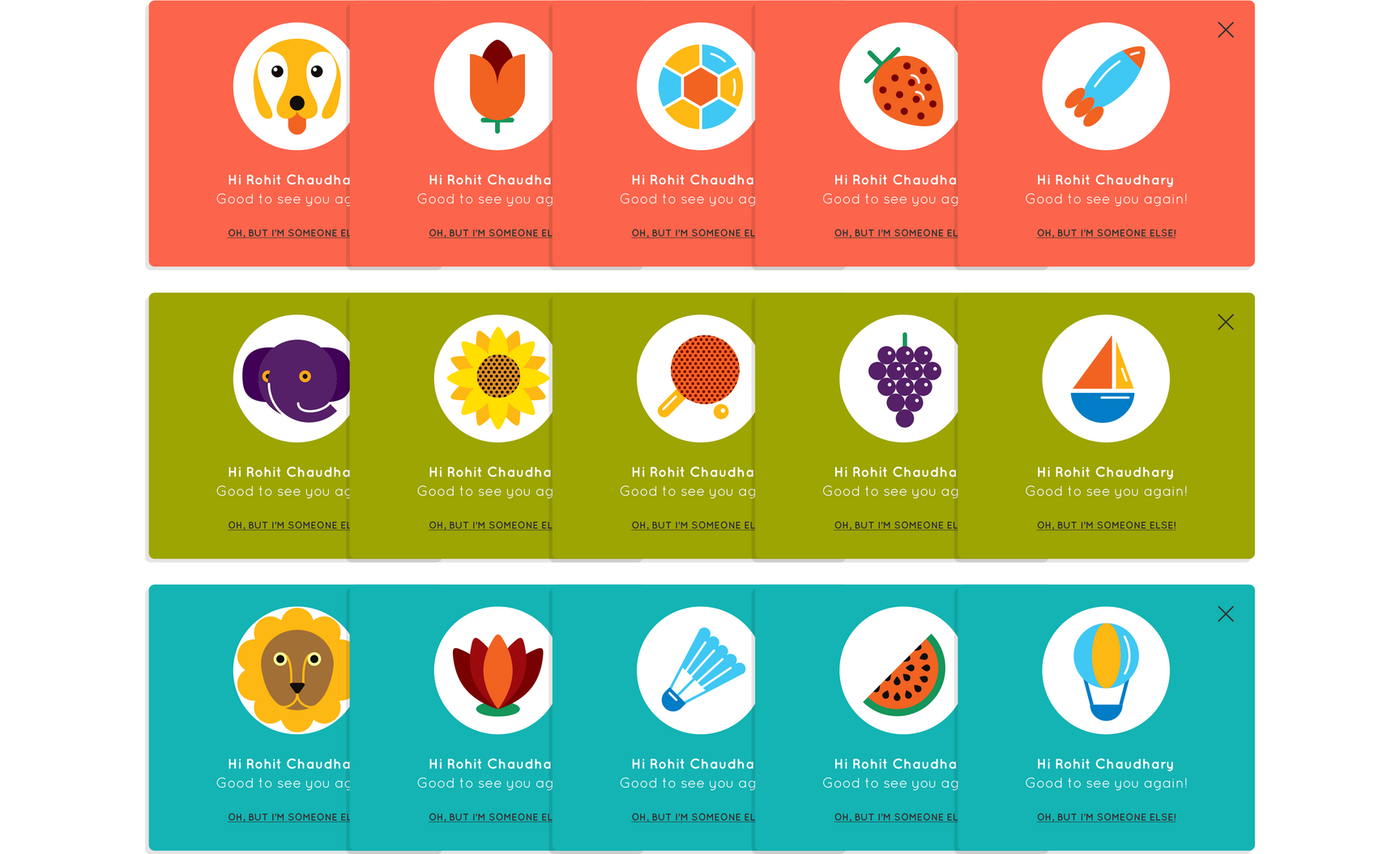
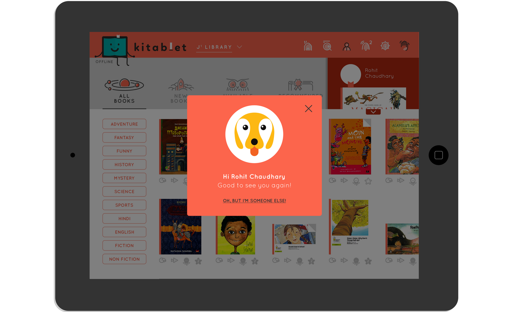
What do you want to be today?
A set of five unique avatars are also available for each library to personalise the app experience for students, drawing from popular themes like flora, fauna, sports, fruits and objects.
Beyond reading: talking books, moving books, activity books
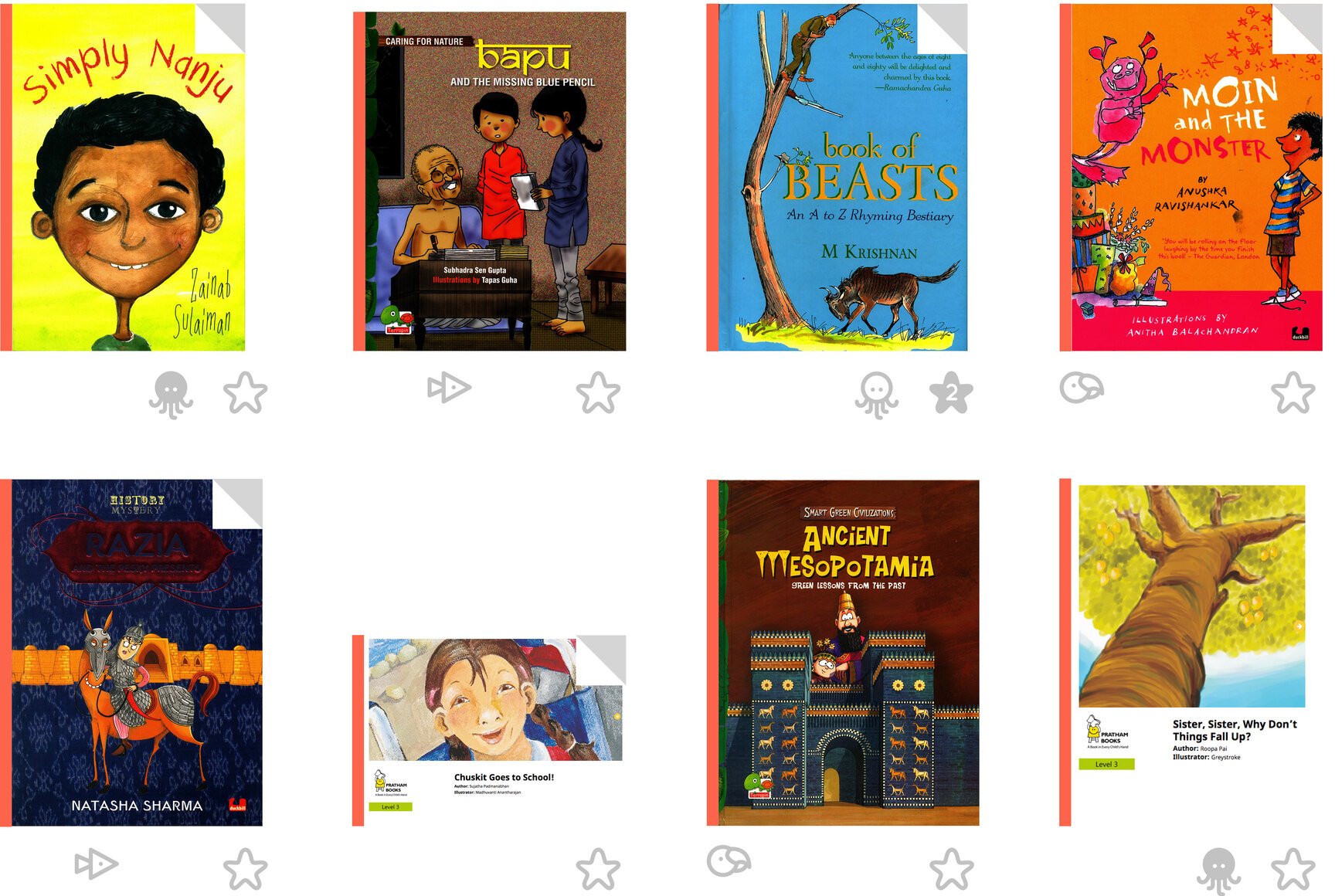
A lot of books in Kitablet come with additional layers of engagement. Shown under the books through small sized icons, these are visible at first glance to entice students to dive in right away.
Parrots love talking or repeating spoken words that made them an instant choice to show the “read-aloud” books. Fish were the choice for books with “animation” for their fidgetiness and an uncanny resemblance to a play button. Octopus had an upper hand (eight of them) when it came to books with “activities”. And a starfish was a no-brainer for the choice for “rating and reviews”. Octopus and starfish also have “completed” states.
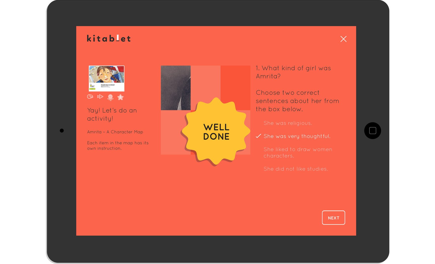
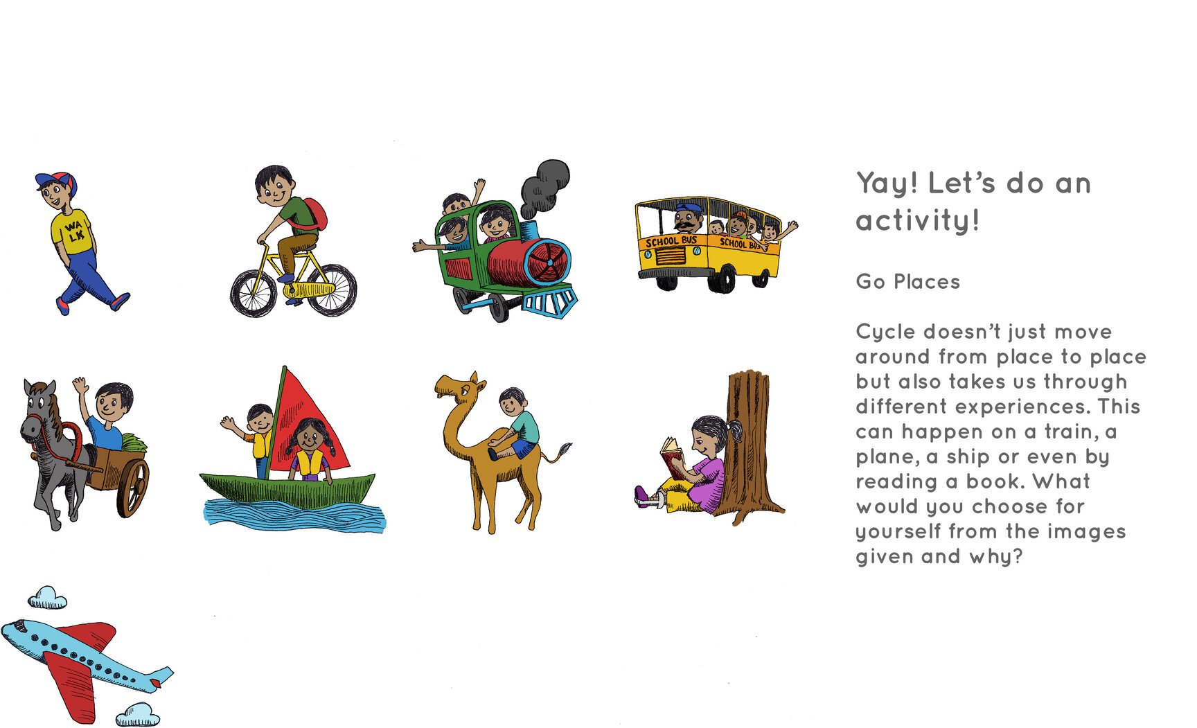
Illustrations for activities
Activities are a big part of Kitablet. Over five unique types of activities were visualised by us, some of which also involved making illustrations for multiple choice questions.
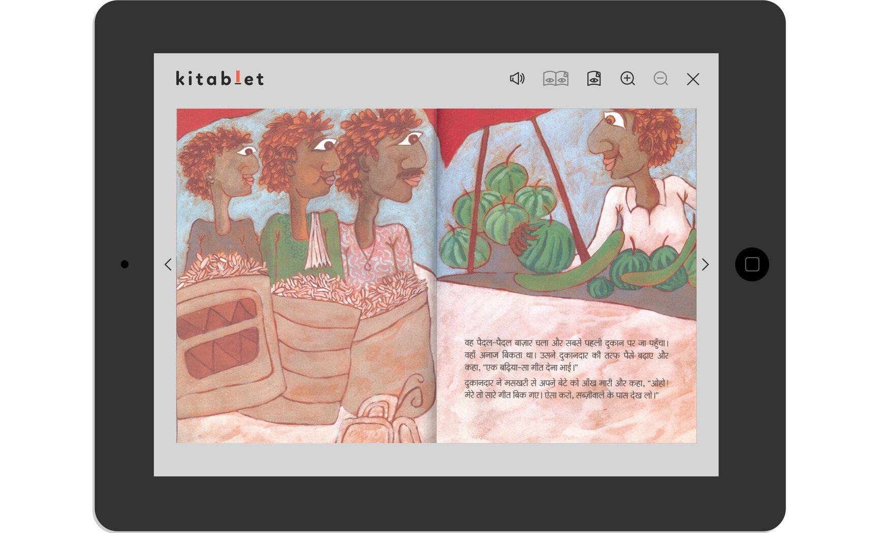
And finally the e-reader
Happy reading!
“Kitablet is fortunate to have Tiffinbox as its design partner for marketing design and product design. On the product design front, Tiffinbox has translated successfully our requirements to a product with a quirky and fun design. The thoroughness of the design process, the ability to interface well with the product development team and the participation till the very end of product testing has ensured that the creative output sees its way to the end users. We highly recommend Tiffinbox especially if you are looking for a design partner who will run with your project as their own.”
Parul Bajaj,
Consultant - Education, Sir Ratan Tata Trust

Kitablet is available on iOS, Windows and Android.