The WASH Photo Project: Exhibition Design
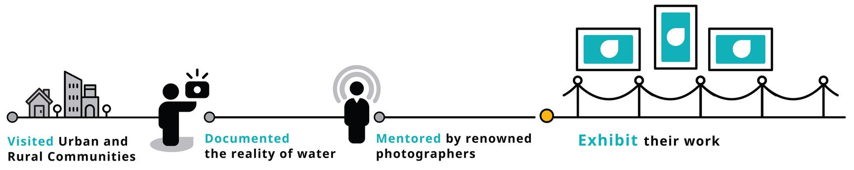
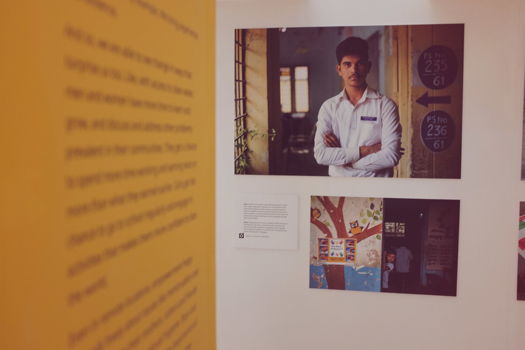
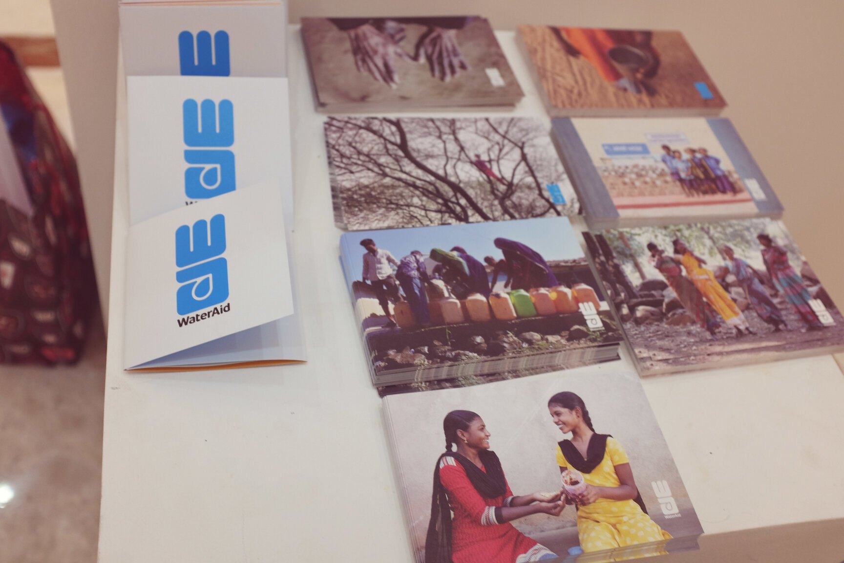
WaterAid initiated ‘The WASH Photo Project’ in mid-2018 with an aim to document the ground reality of water across India. Seven fellows chosen under the project, travelled extensively across ten states to capture the water crisis in India and how urban and rural communities are dealing with it. This project culminated in a photo exhibition that was set up for the World Water Day on 22 March 2019 and was open to the public for the weekend. Our role in this, apart from designing the logo and communication collaterals like call-for-entries, pamphlets and postcards, was to conceptualise the whole exhibition’s look and structure.
WaterAid India is part of the global WaterAid network which has been working for four decades to improve access to safe water, sanitation and hygiene across the world. We worked with WaterAid India from 2015 to 2021 on a large variety of communications such as graphics/infographics for social media, animated videos on handwashing and menstruation, publications, campaigns on menstrual hygiene and covid-19, and new year diaries and calendars for three years.
Concept
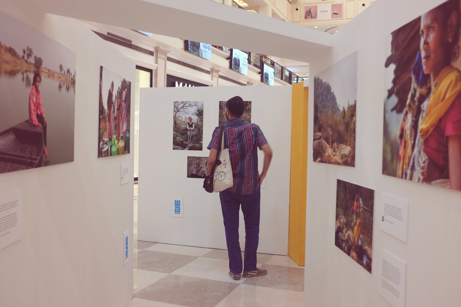
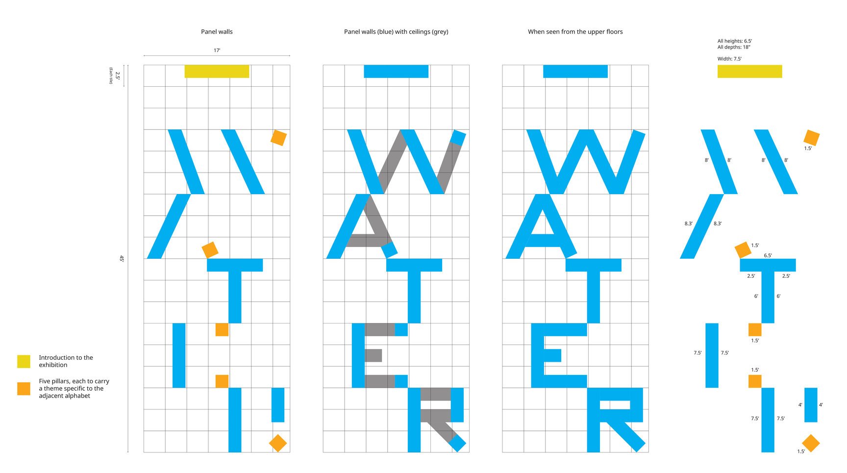
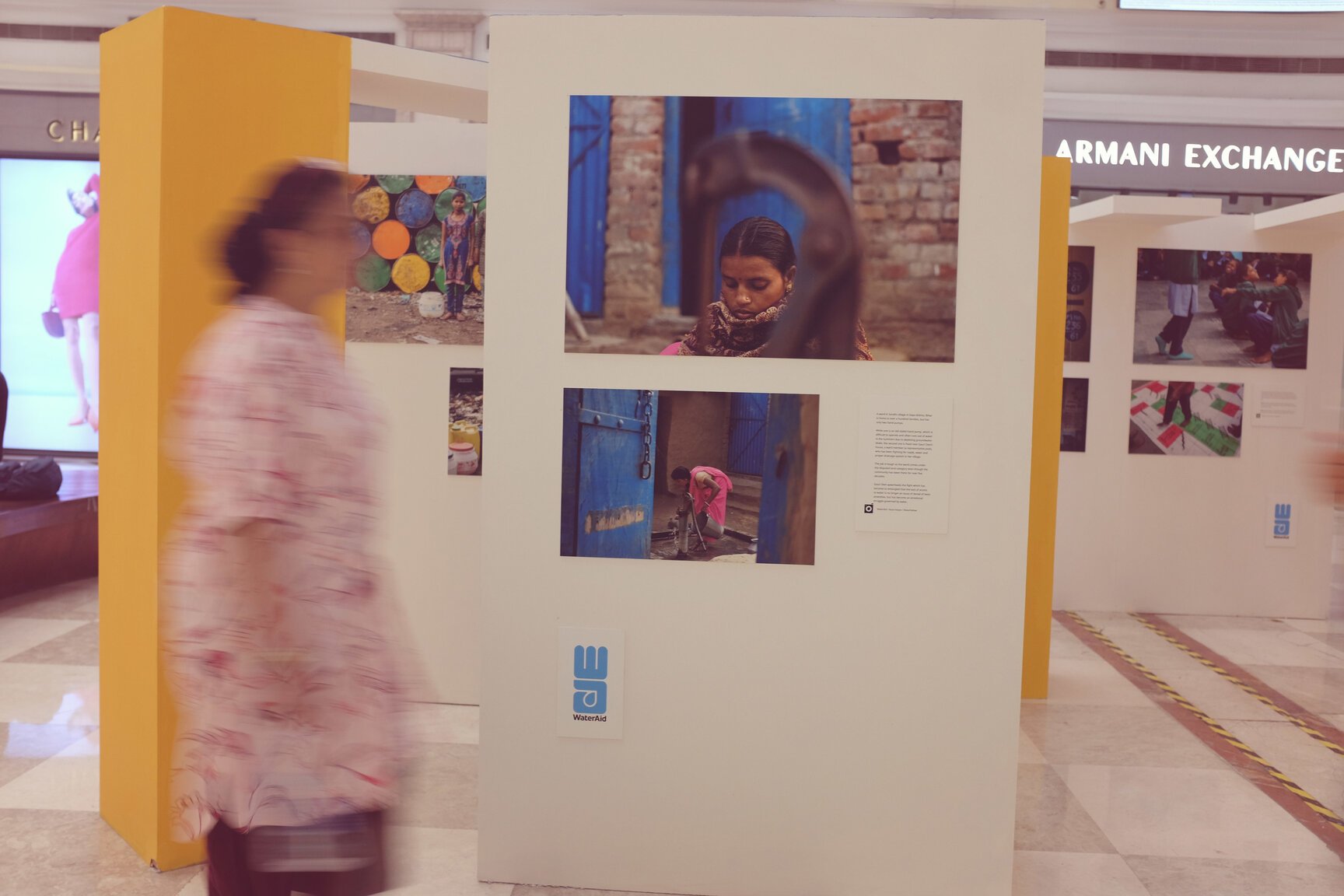
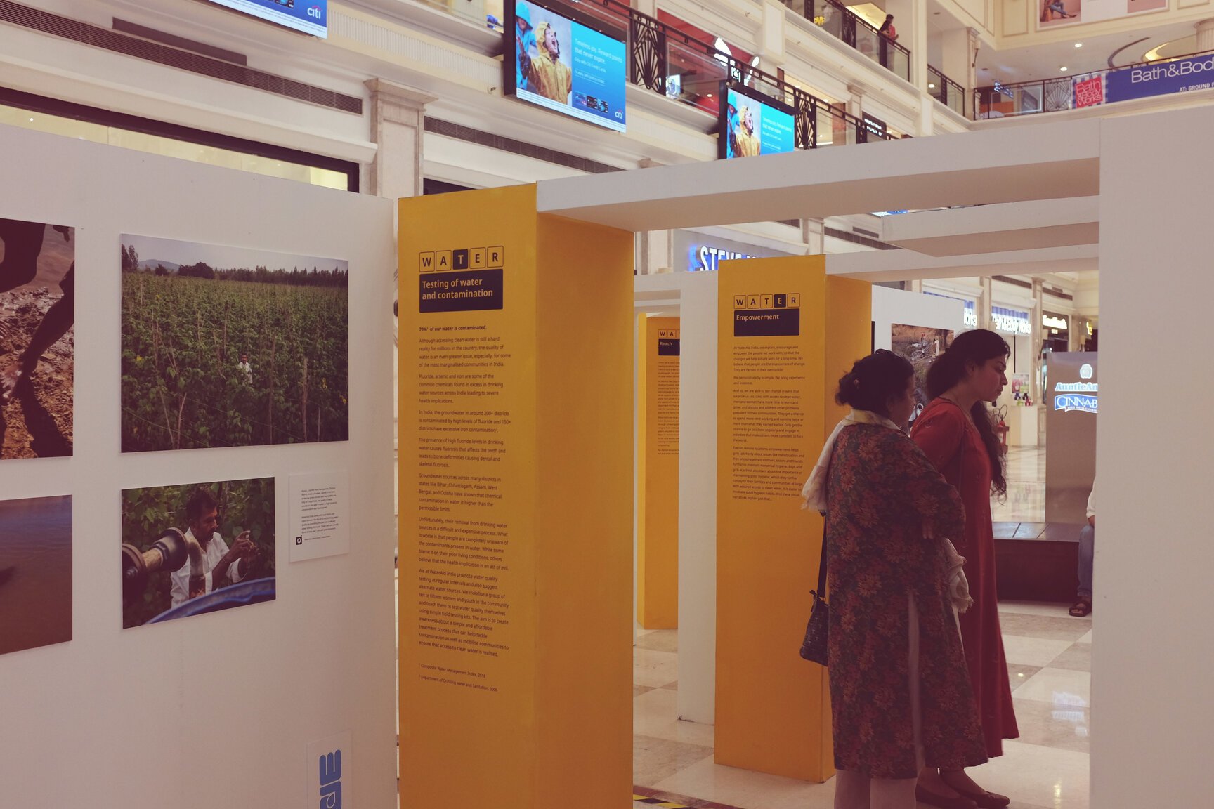
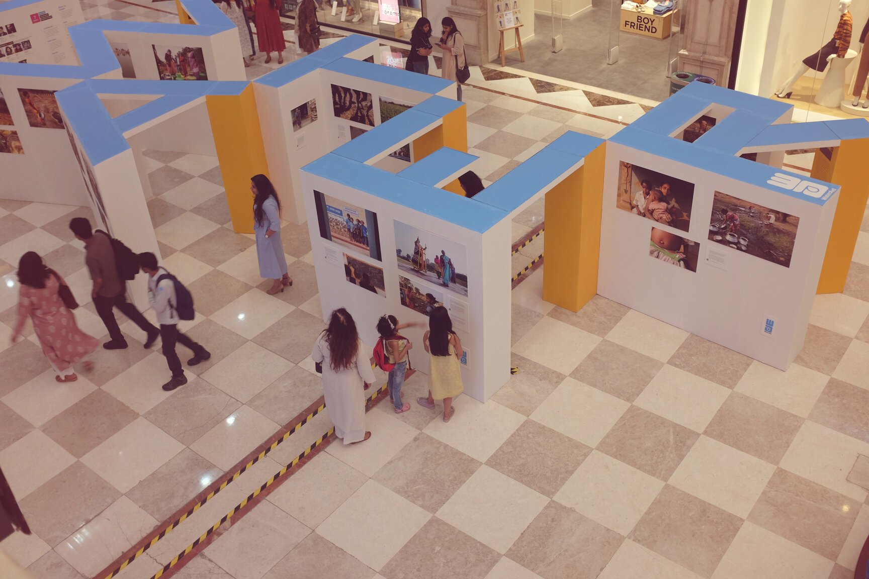
The venue for the exhibition was a popular mall in south Delhi. A visit to study the available space threw up an exciting proposition – what if the design has an added layer of meaning for passersby on the upper floors instead of just being relevant to people in its immediate vicinity? The resulting idea was to create panels shaped as alphabets and positioned in such a way that the whole set up reads as ‘WATER’ from above, thereby communicating the theme in the simplest manner possible and perhaps even evoking curiosity. Further, each alphabet was associated with a sub-theme (there were five themes in all that dealt with various aspects of water) that appeared on a yellow-coloured pillar (which also doubled up as support to the ceiling).
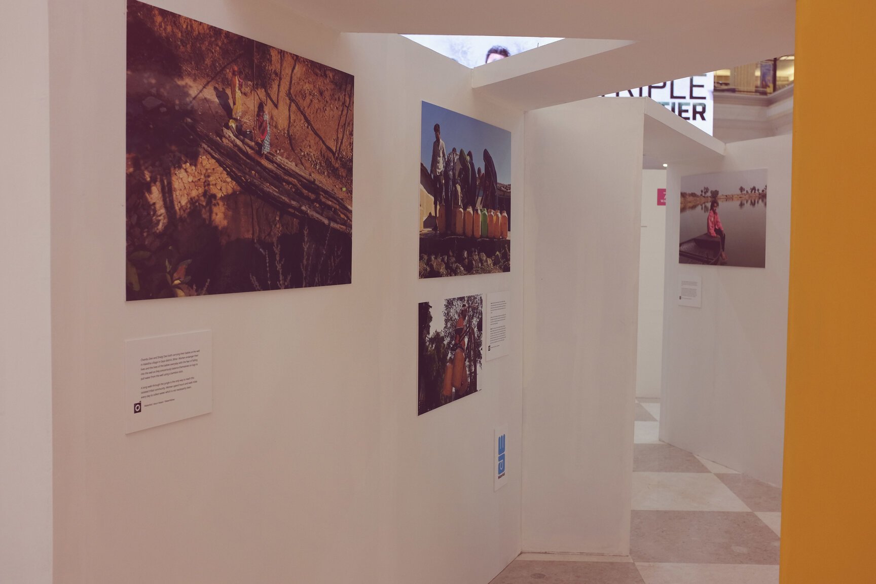

Photos from the exhibition
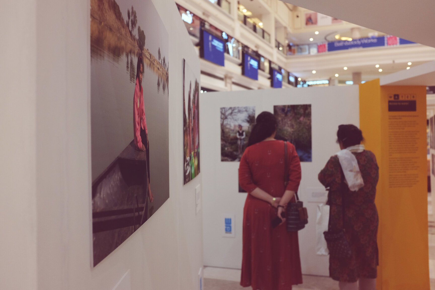
The real challenge was taking a call on which alphabet walls to keep, which to remove and finally how to position each alphabet in relation to the next. The final plan offered a very fluid movement for the people and a long line of sight that would allow them to see more and not be boxed by what otherwise could have been a rigid space. We loved the various angles and combinations that arose, a lot of which was not even possible to imagine on paper. Another very clear advantage of the design was the absence of a single entry/exit point; one could enter from anywhere, leave from anywhere, or have a quick glance on the go without having to enter/exit. There was something for everyone.
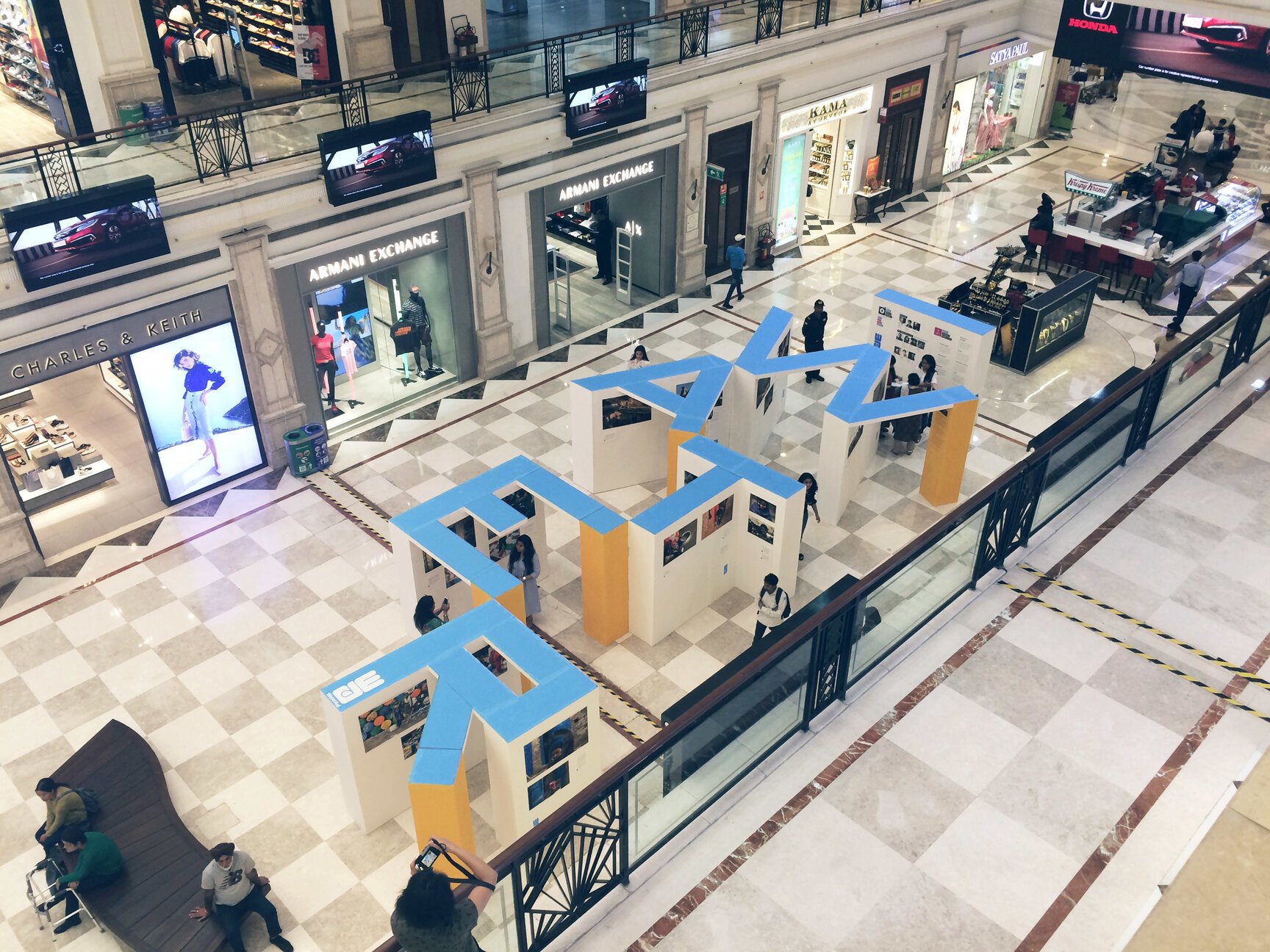
View from the second floor
Designing within the constraints of the space was an exciting opportunity for us to come up with ways to deal with those immovable challenges. How do you size and position the panels in the limited space without hampering people’s movement?