Branding a Smart City – New Town, Kolkata
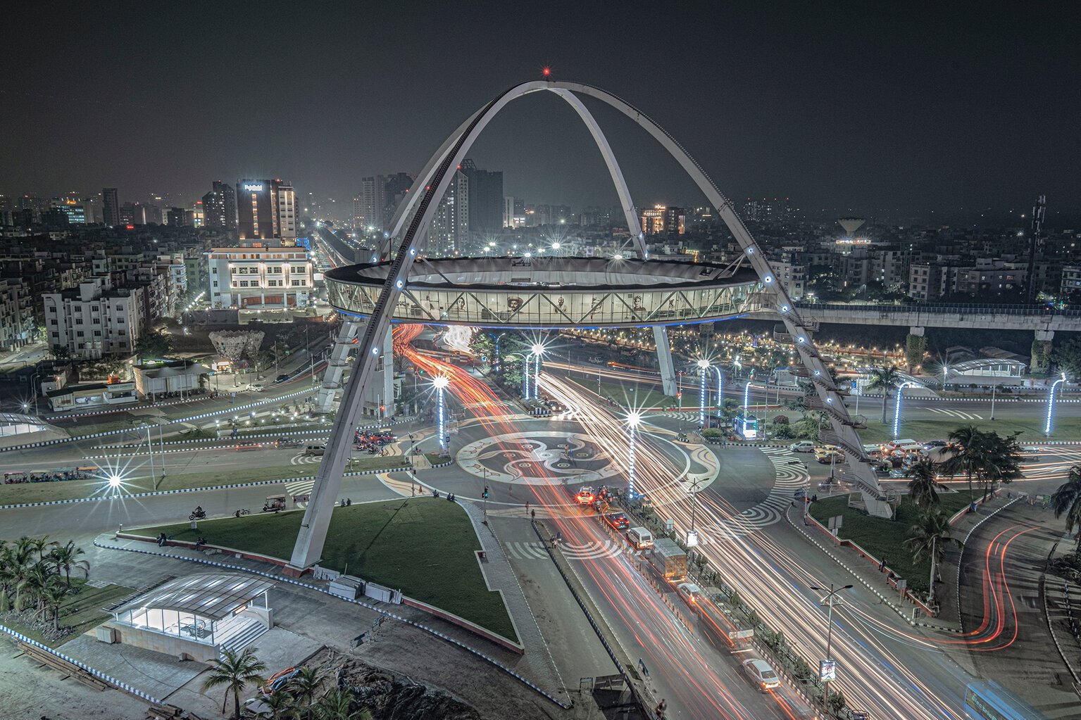
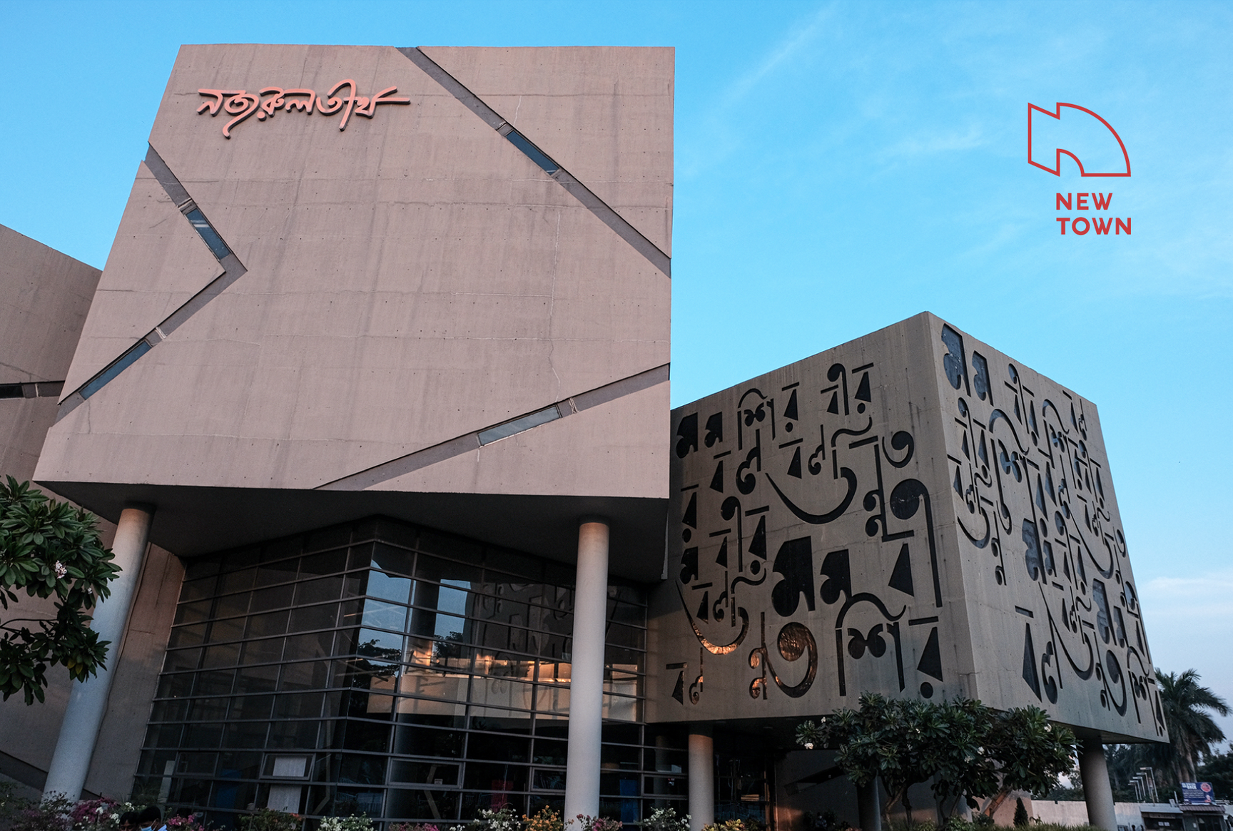
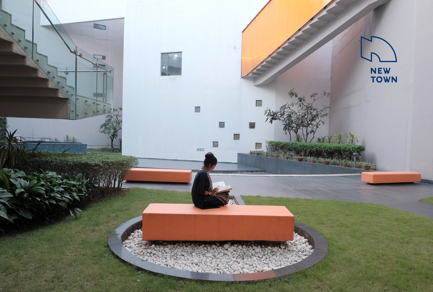
New Town, a satellite city near Kolkata, is designed to optimise both work and life. In its proximity to airports, universities, and tech hubs, New Town is primed to host smart global companies. In its platinum-rated green design, its clean infrastructure, and its open spaces, New Town has created a model of true urban sustainability. And in its libraries, auditoriums, and performance spaces, New Town offers a vision of a different kind of existence — one dominated not by the stresses of the rat race, but by the joy of culture and of a life well lived.
It is this positioning that the London based place branding experts INSTID (Institute for Identity) and Tiffinbox focused on as part of their work to develop a strategy and brand New Town to attract foreign investment from sunrise industries such as fintech, data science, AI and machine learning, biotech, data centres, and blockchain to name a few.
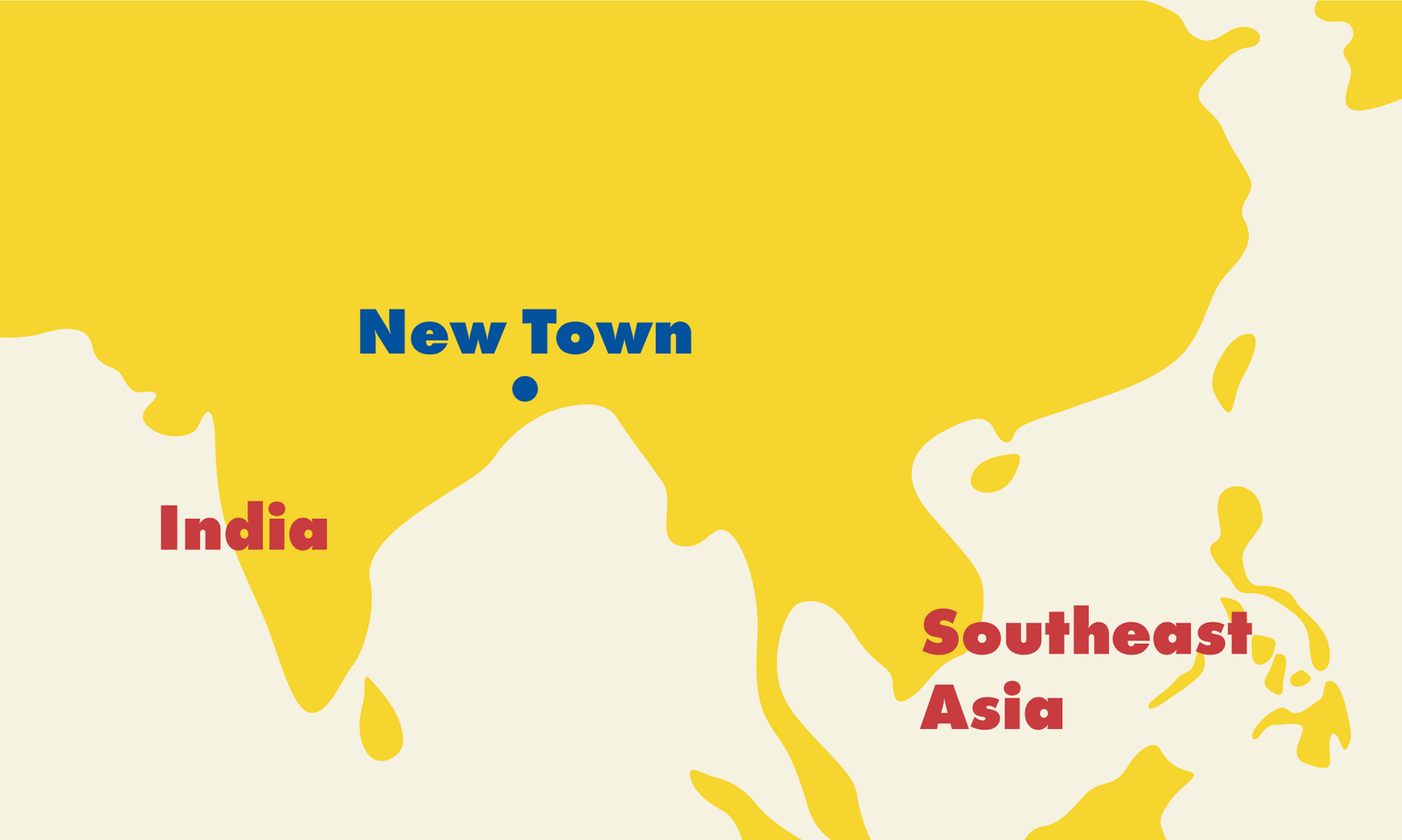
New Town is the future of work — and urban life. To be sure, it is a town designed to make work smooth. Its 3,000 hectares of land and infrastructure amply support corporate and academic campuses and tech parks; it sits near Kolkata, one of Asia’s great cities and a gateway to Southeast Asia and the Far East; it attracts a vast pool of skilled graduates from Kolkata and the rest of India. Dozens of fintech firms and legal offices have already found homes here. But New Town is not just another tech hub. It provides a vision of what work in the 21st century ought to be.
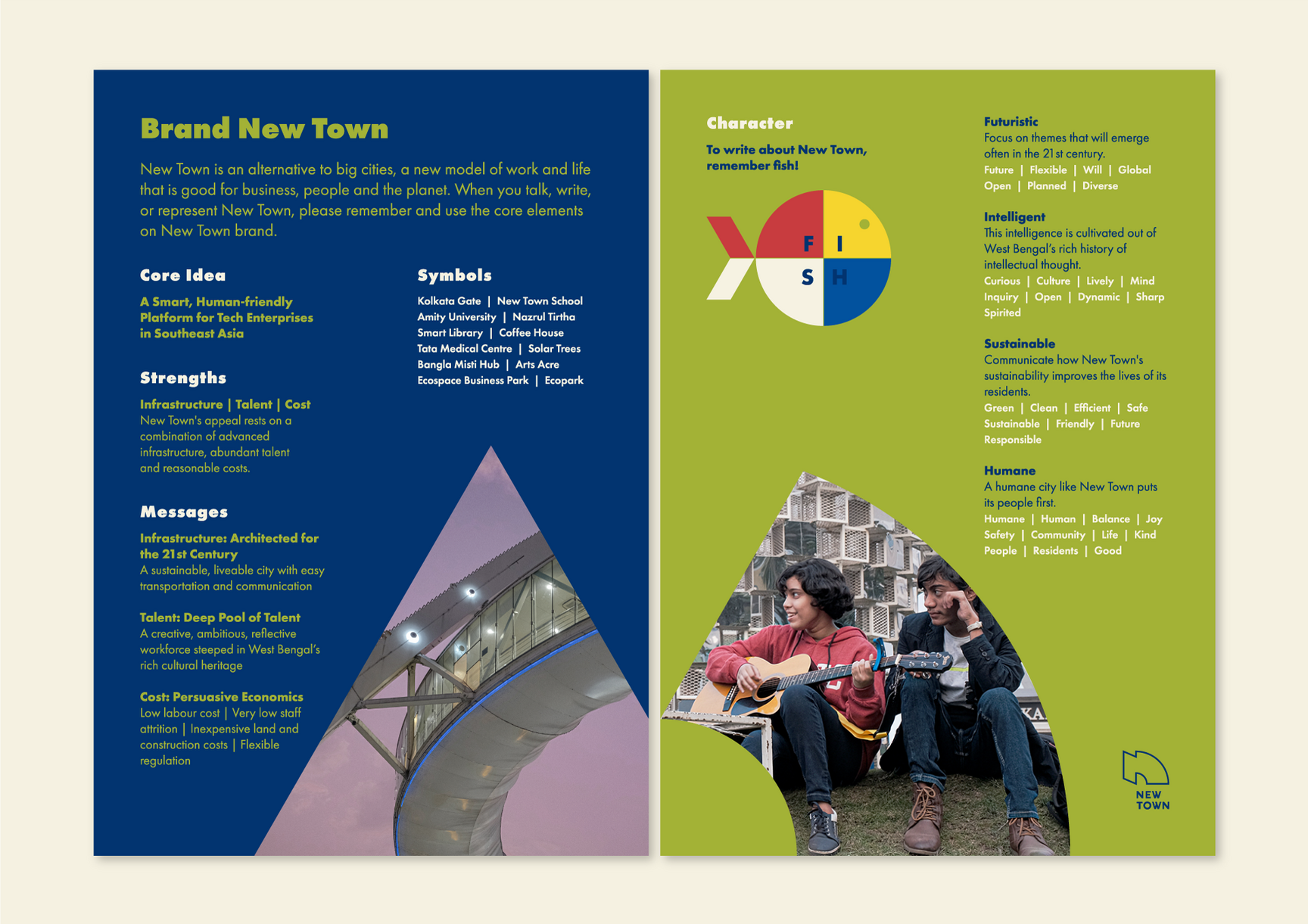
The core idea – a smart, human-friendly platform for tech enterprises in Southeast Asia – was borne out of three archetypes that most resonated with New Town: new standard (a new, alternative vision of urban living; work-life balance, that is driven by concern for the human and the planet), good life (physically easy and enjoyable as well as spiritually enriching; no harm to planet or humans; brimming with youthfulness and energy) and knowledge (ability to have a vision for the future; to transform and to create previously unknown and complex ideas from a deep foundation of culture and knowledge).
These archetypes were used as a guiding light to succinctly describe New Town's persona in the form of messages, tone, and the visual style of its communication.
Logo
We began the logo journey with type-based options that explored concepts like “west in the east” and imbued them with traditional (Bengali architecture) and modern (typography) influences; a concept rooted in Kolkata and its culture. We also explored a super futurist option that incidentally had a very distinct nod to New Town’s close proximity to the airport. But a logotype was not meant to be as the general expectation was for a logo with a symbol.
The final New Town logo is part futurism and part humanism in keeping with the core idea. It is the 1 and the 0, it is the high rises and the water bodies, it is the disruptive and the zen, it is the predictable and the vibrant, it is work and it is life. It is an outline in a colouring book, waiting to be filled by newer experiences that shape the alternative that New Town offers to the other high-tech destinations in India and Southeast Asia.
New Town is modern (state of the art, tech-savvy, progressive, advanced, fresh), rational (structured, organised, predictable, intelligent, clear, knowledgeable), open (spacious, breathable, unconstrained, liveable, zen), caring (green, healthy, friendly, safe, easy, kind, sustainable) and energetic (passionate, committed, a sense of ability and of things happening, vibrant)
The character or the feeling of New Town can be summed up in these five words. This, is what drove the visual style.
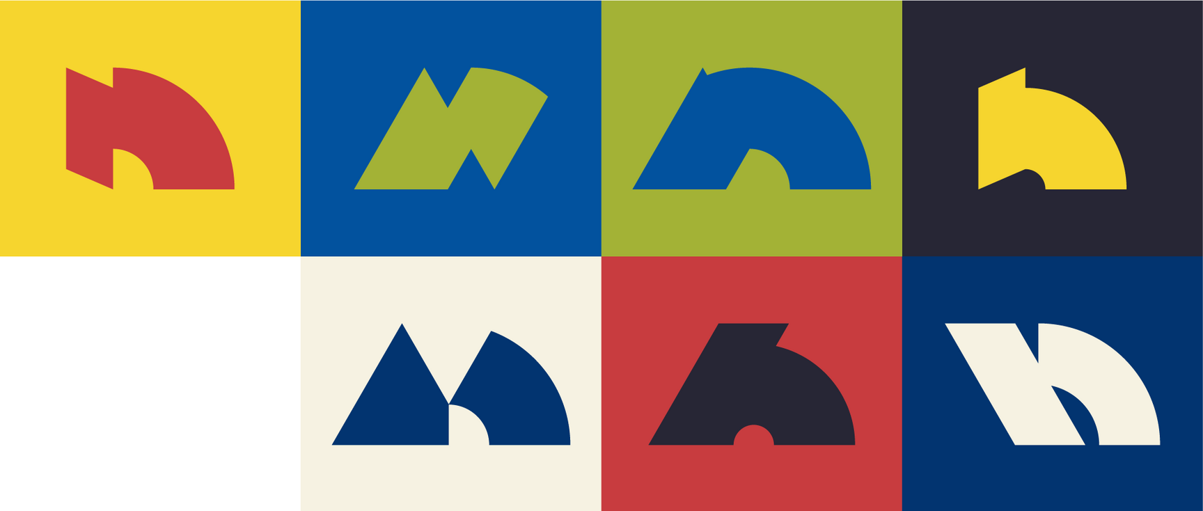
Building Blocks: N Family
New Town, like any other young city, is by no means a completed work. Ten years hence New Town might turn out radically different from what it is today. It is the transitory nature of its evolution that we wanted to capture through not just one N but a family of seven Ns (including the logo symbol), wherein any of the Ns could stand for the New Town of future.
But not just for future. These Ns are relevant now too, as they capture the dynamic spirit of New Town today. Just like how New Town offers an alternative vision of urban living, the N family offers alternative forms of the New Town logo.
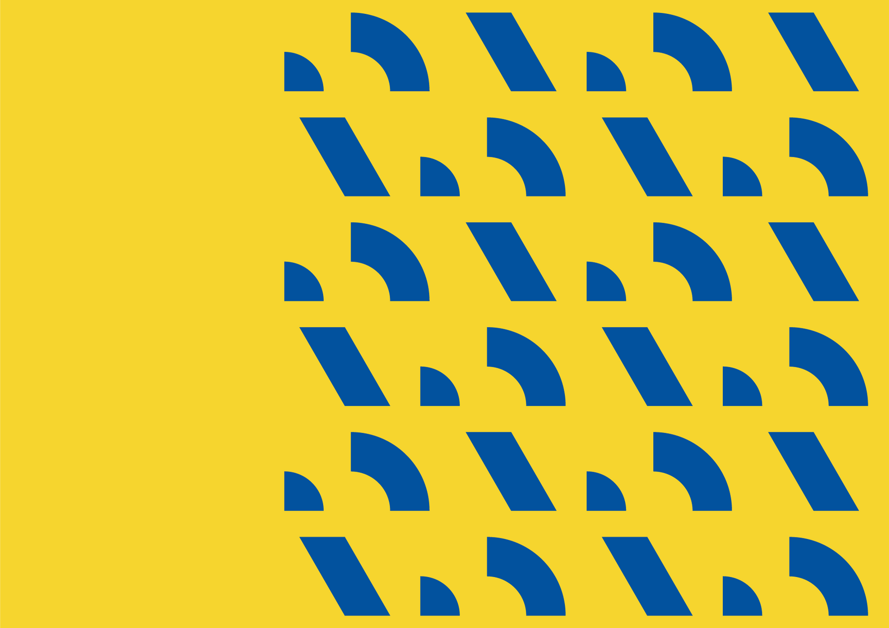
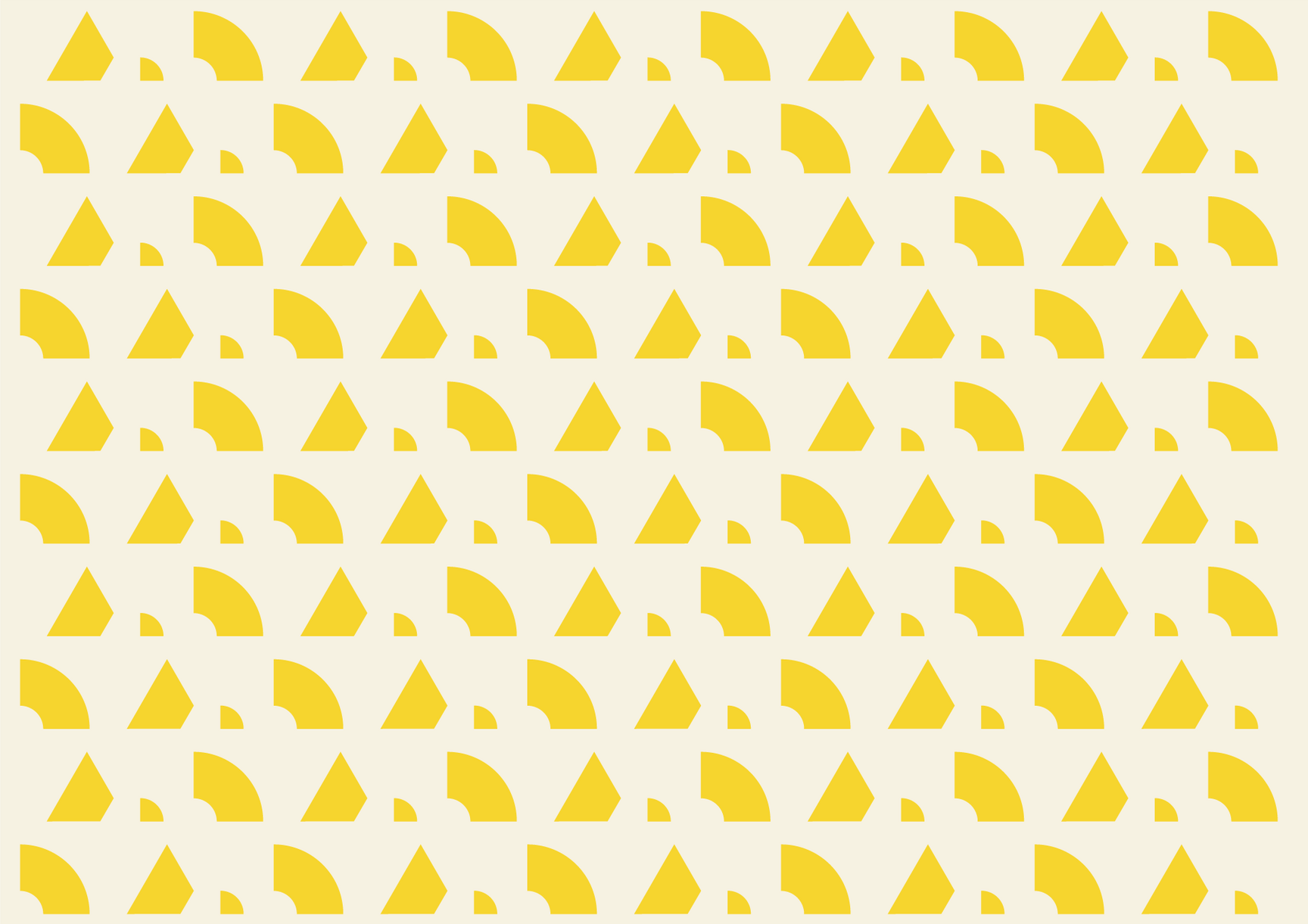


Building Blocks: N Patterns
The N Family forms the backbone of New Town’s visual identity. Broken up into their base shapes, more like deconstructed, and then rearranged to form patterns, they amp up the whole look and feel of the designs.
They help achieve two of the five characters of New Town – rational, through the use of very structured patterns that follow a grid at all times, and energetic, through the vibrancy that is achieved with and within these patterns.
Building Blocks: N Containers
A further design extension of the N Family explores their integration with content such as carrying statistics within them, or being used for quotes where the shapes of an N feature a person’s photo alongside their designation, or housing a single photo or two contrasting photos that bring forth the concepts of work and life.
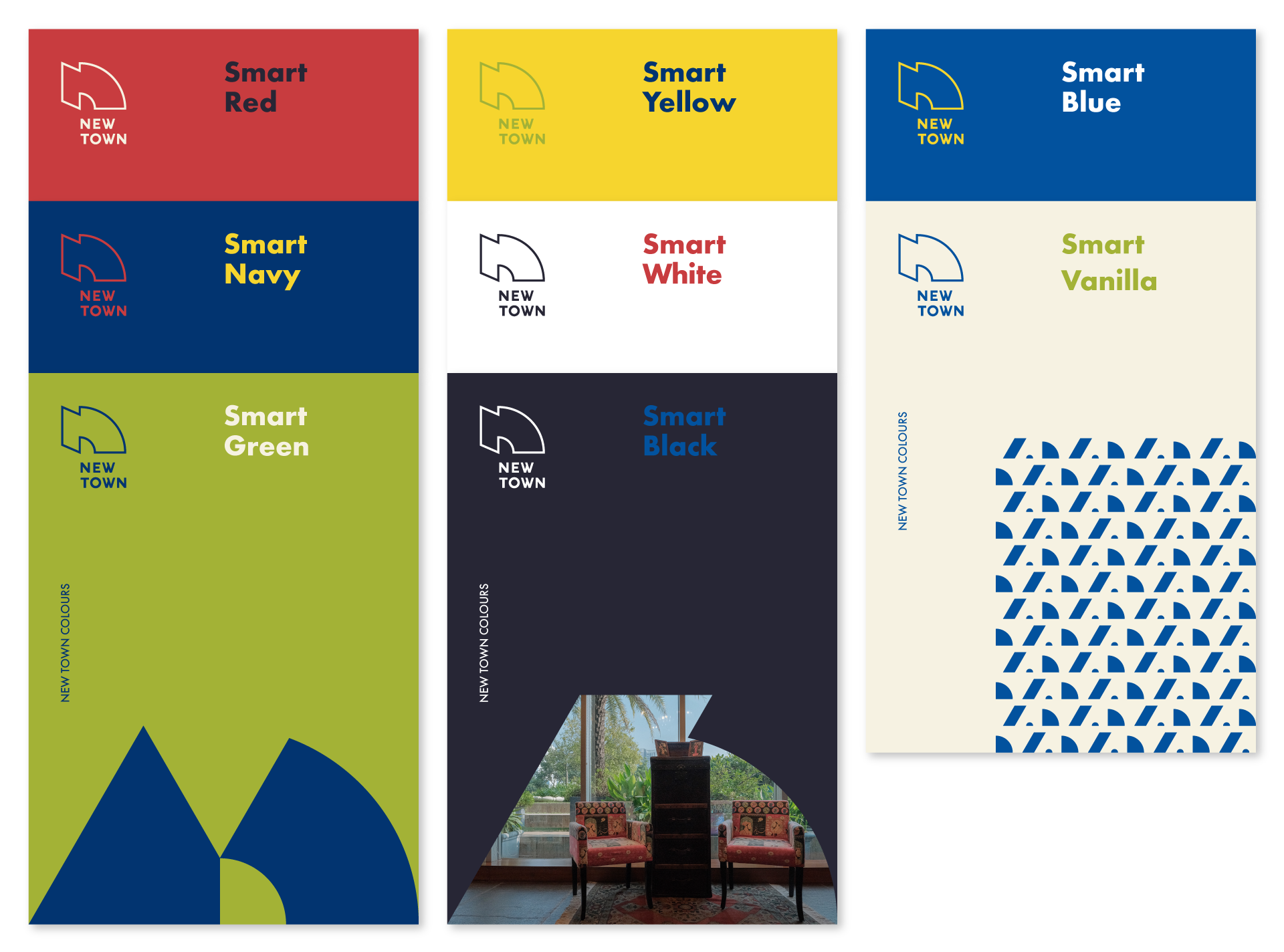
Building Blocks: Colours
New Town’s colour palette has six colours along with black and white. It offers a mix of warm and cool colours, bright and light colours, and colours that complement each other.
The red references the cultural setting of Kolkata and brings with it energy and passion, the yellow adds cheer (and optimism) as it acknowledges a very nostalgic presence on the streets of Kolkata, the blues look into the future and instil a sense of trust and commitment, the green is all about the open green spaces and the emotions of balance and harmony, and the black powers through timelessness and sophistication.
Modern, one of the characters of New Town, is realised through this fresh colour scheme.
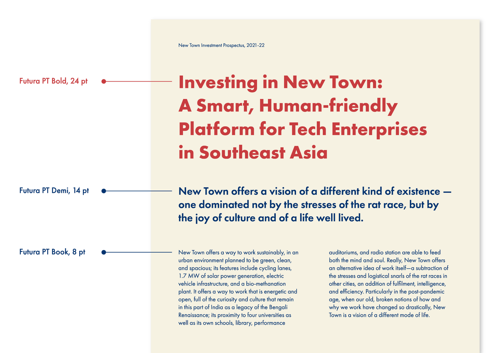
Building Blocks: Typography
New Town’s typeface is Futura PT (seven weights and their corresponding obliques), a sans serif typeface that is based on simple geometrical forms: near-perfect circles, triangles and squares. It has an appearance of efficiency and forwardness which makes it a perfect match for New Town.
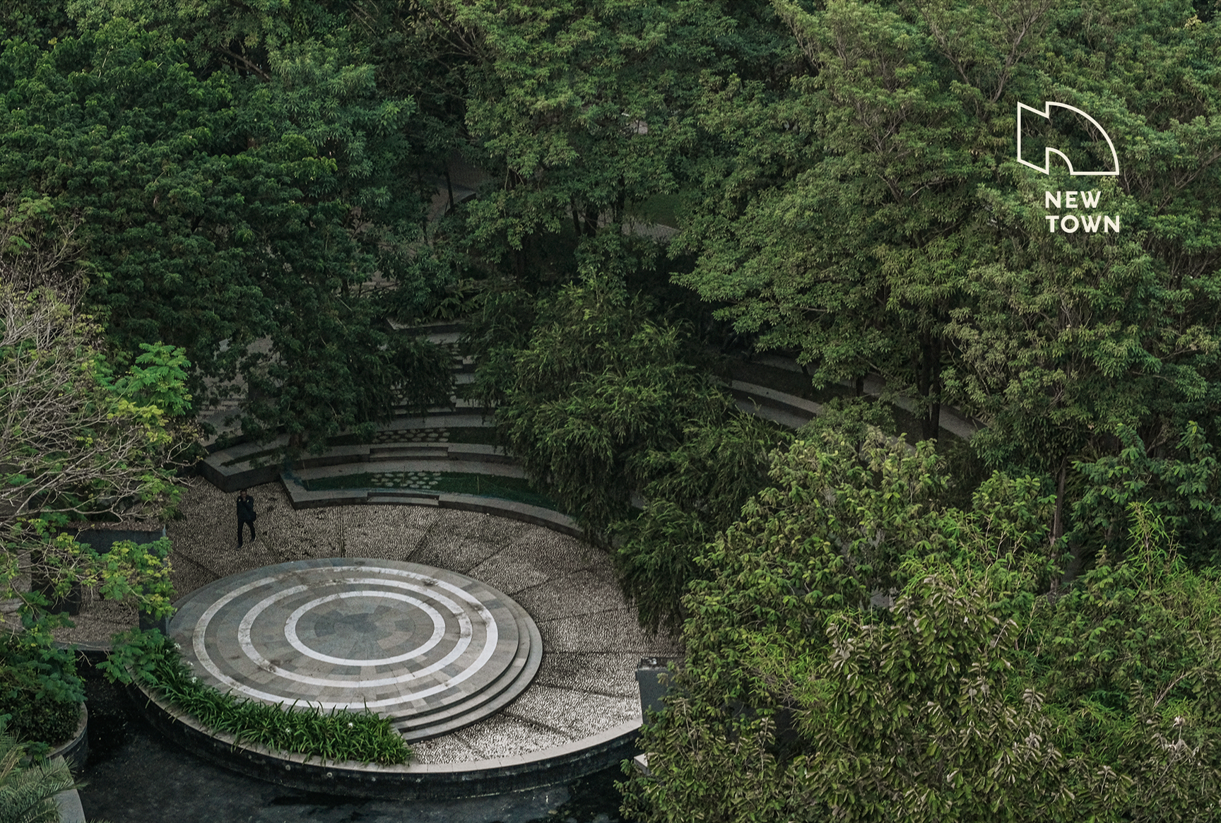
Building Blocks: Photography
A new photo bank was put together with shots that reflect the personality of New Town – a nature-friendly city offering a good, conscious and easy life. They lay evidence to the city’s claim to be a new model of urban living where smart technologies and care for people and the planet provide for a harmonious work and life environment. The focus was on natural aspects of the town, its open spaces, its skyline, and everyday life.
Verbal Identity
The character of New Town can be described by a set of adjectives that can be classified under four categories. These categories – futuristic, intelligent, sustainable and humane – can be remembered by the mnemonic FISH. These four, interrelated ideas act as a guide to not only what to communicate but also how.
New Town Website
A simple ‘business card’ website was developed as a landing site for all the basic information about New Town. Categories like New Town’s location, investing in New Town (what, why, how), and living, studying and visiting New Town offer a brief overview of the place.
The visual branding bases itself in the fundamental fact that New Town is new but it is also safe and easy to be in. One of its strengths lies in its affordability which we have tried to bring out by adopting a design language that plays off predictability and familiarity, but also at the same time stands apart from other Smart cities (Indian and International).
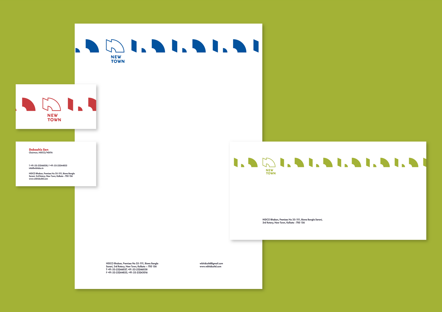
Design Examples – Stationery
A few design examples follow that further illustrate two of the remaining characters of New Town – open and caring, through minimalism and an easy balance of designs.
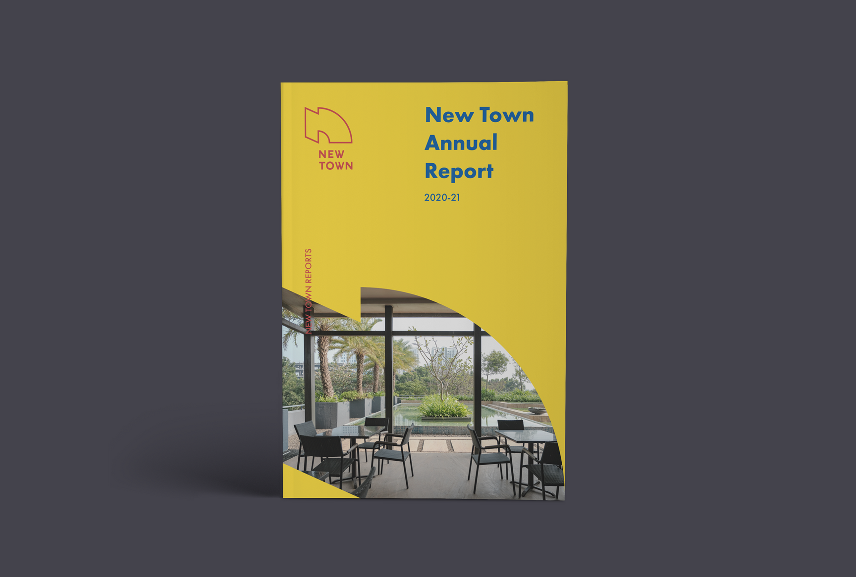
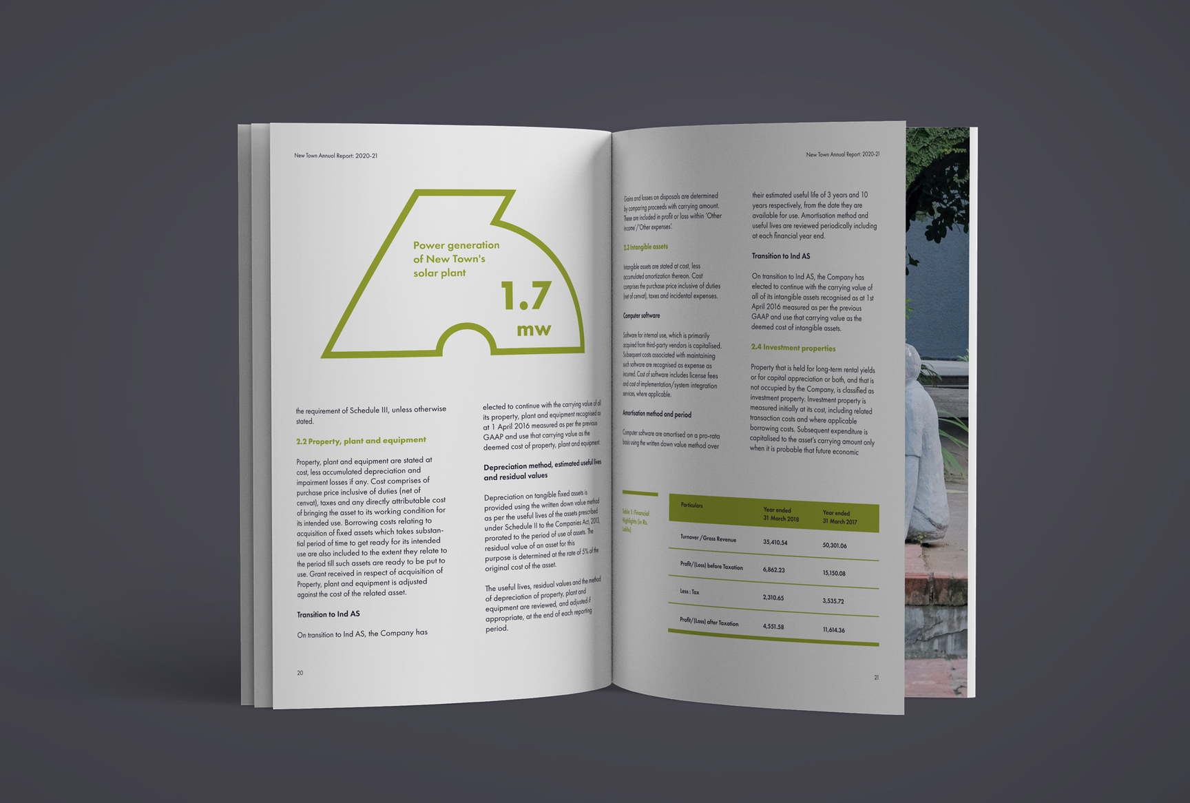
Design Examples – Reports
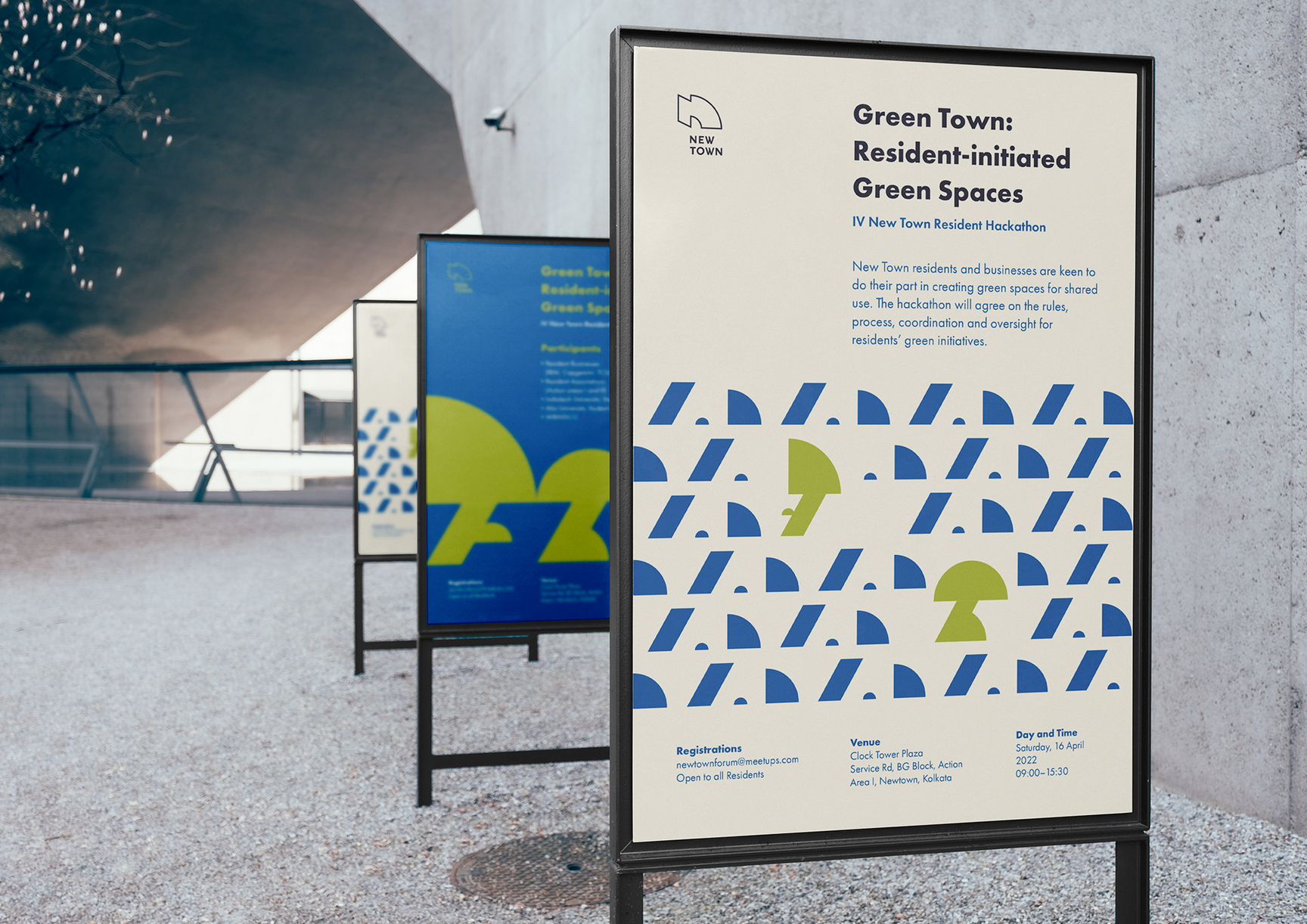
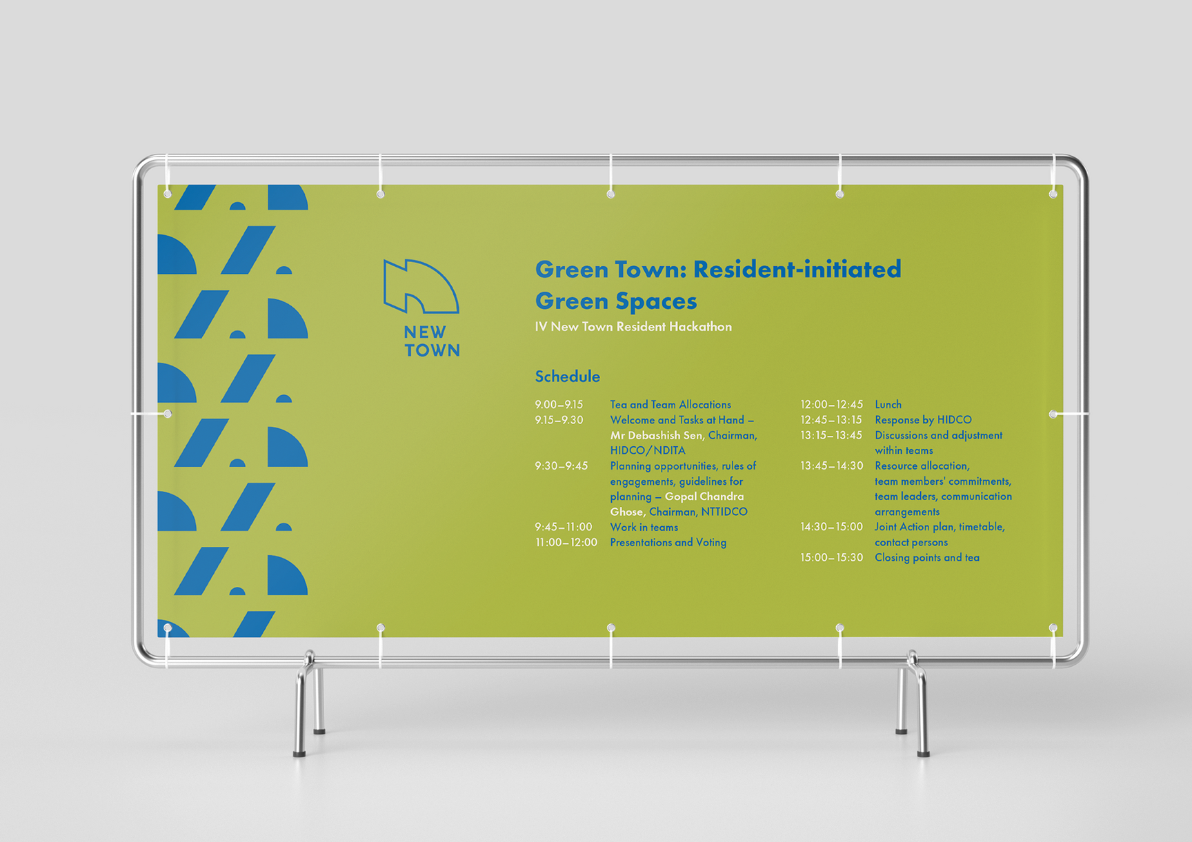
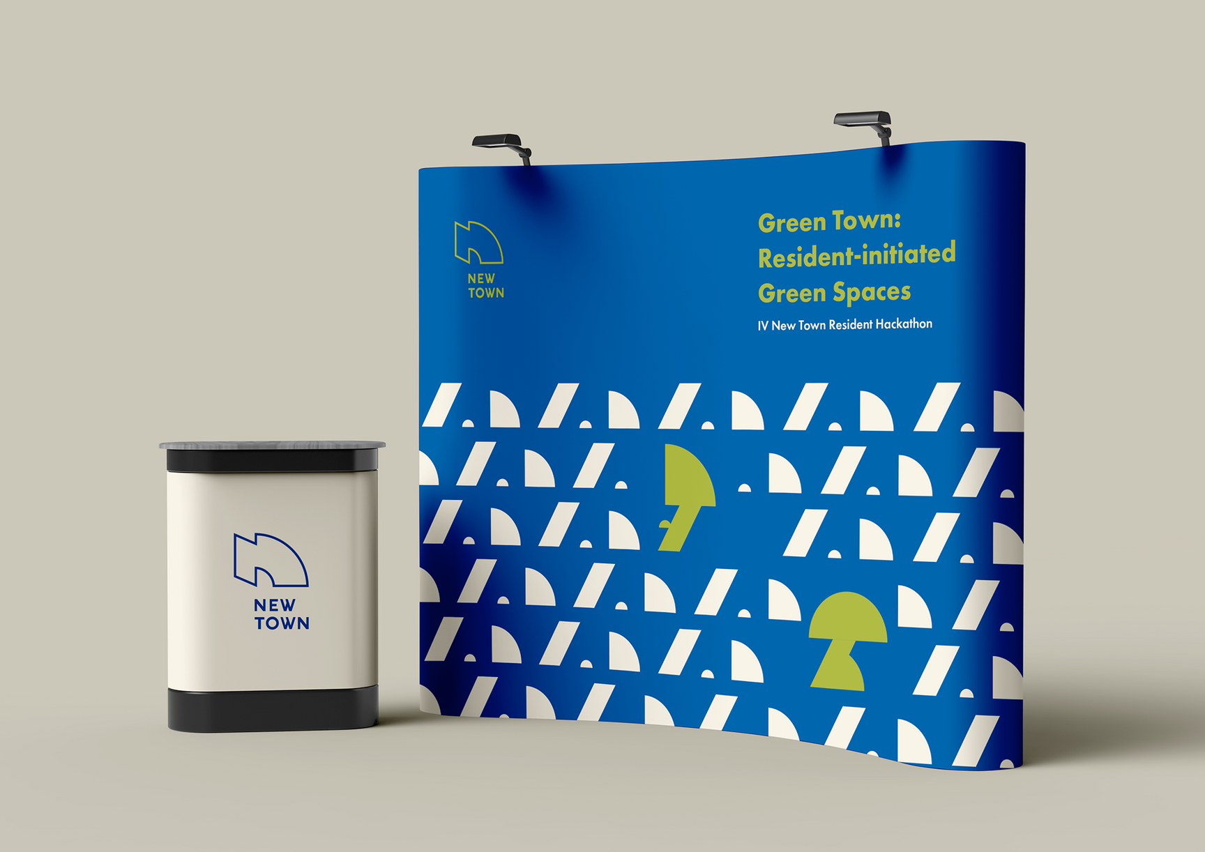
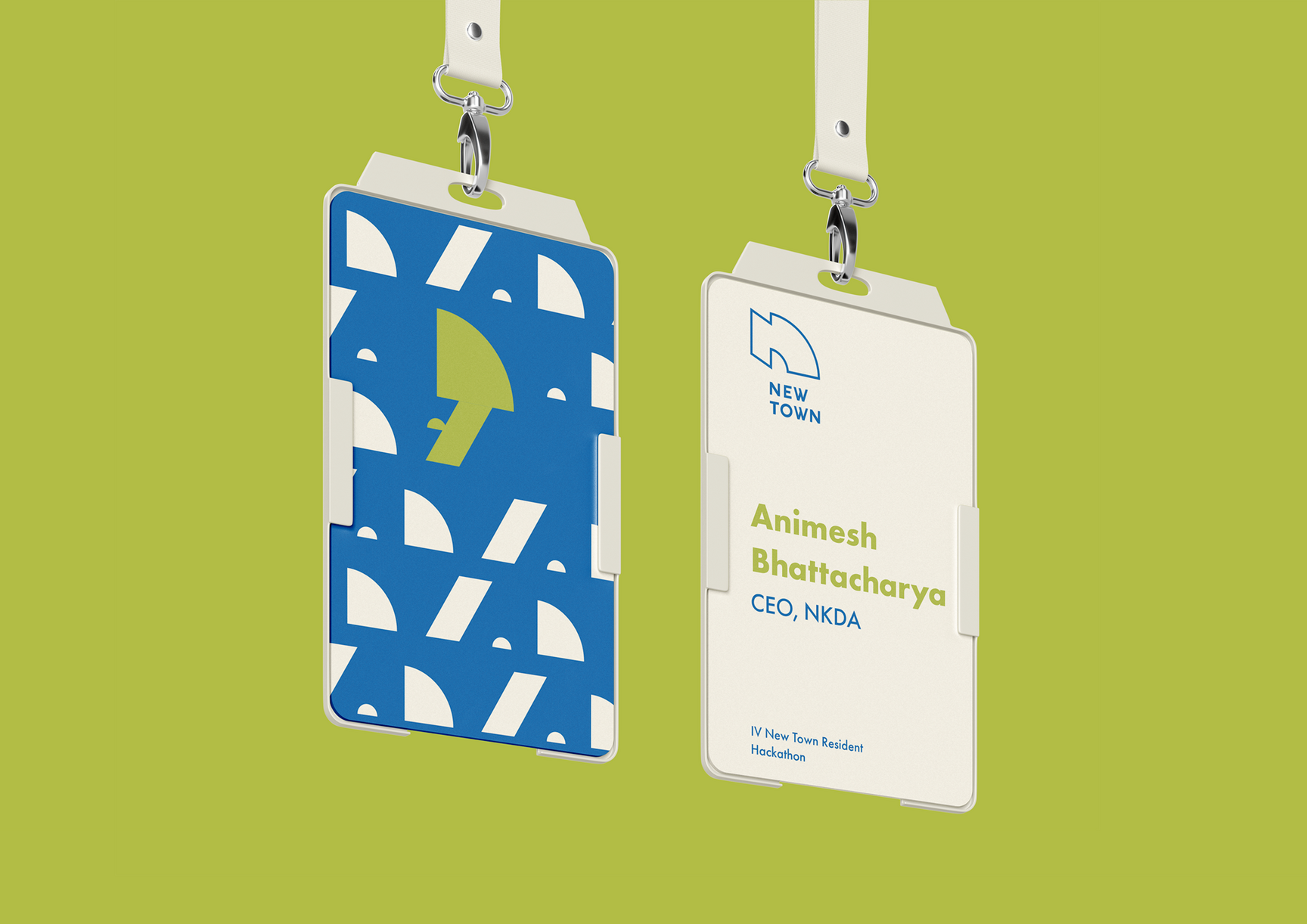
Design Examples – Events
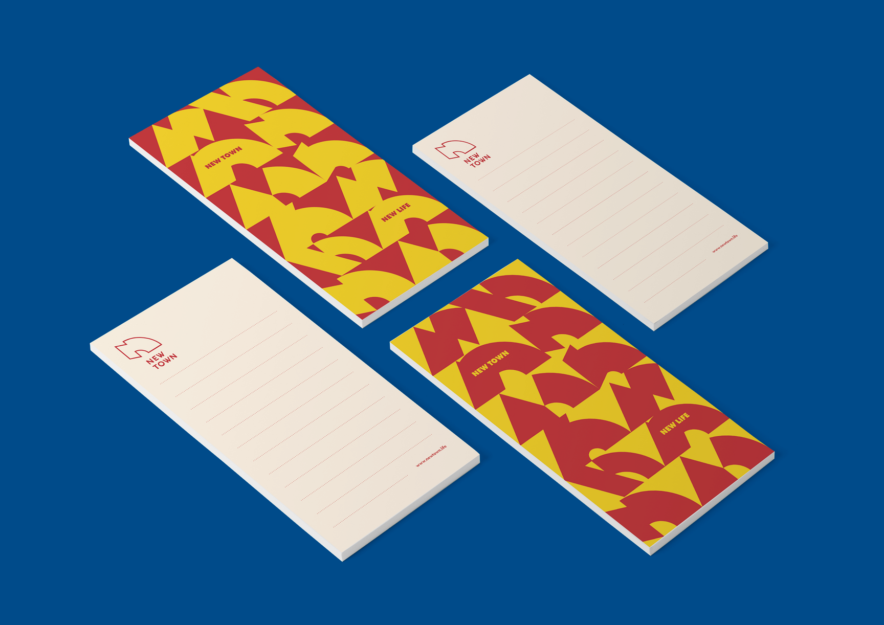
Design Examples – Notepad

Design Examples – Mug
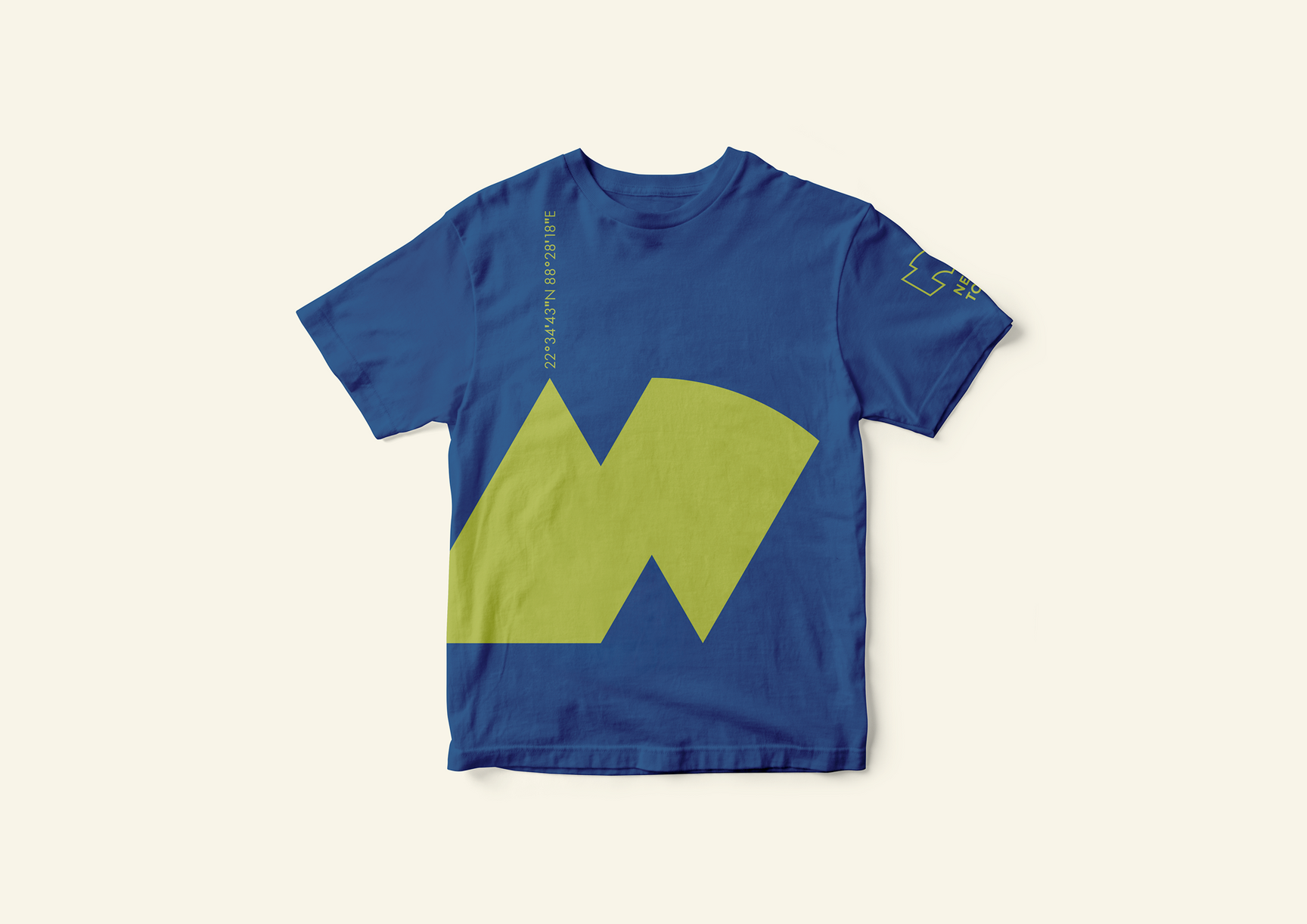
Design Examples – Apparel

Design Examples – Face Mask
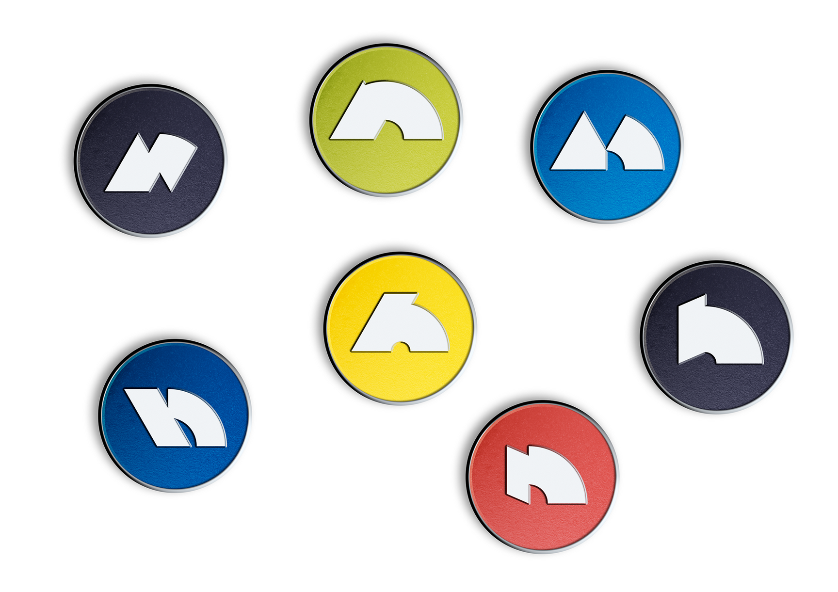
Design Examples – Pins
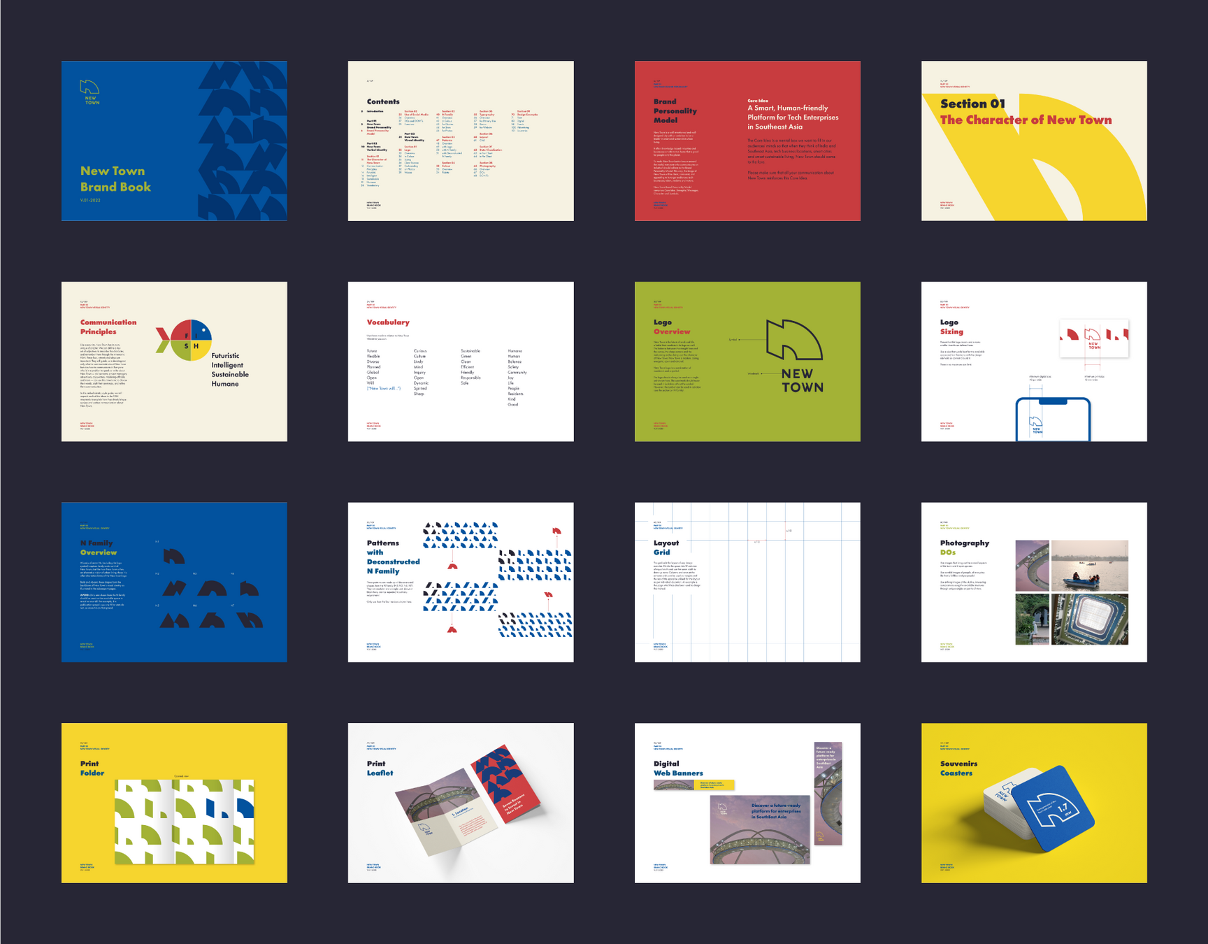
A few pages from the Brand Book
Project Team
INSTID: Dr. Natasha Grand, Samanth Subramanian, Zoe Kennan, Nichola Mark
Tiffinbox: Sriparna Ghosh, Rohit Chaudhary
Photography: Saumyajit Sen
Website: Kiril Tserashchuk